Summary
Summary
Summary
This project was part of my internship, aimed at conceptualising and creating an analytics dashboard for a reconciliation product.
This project was part of my internship, aimed at conceptualising and creating an analytics dashboard for a reconciliation product.
This project was part of my internship, aimed at conceptualising and creating an analytics dashboard for a reconciliation product.
Duration
Duration
Duration
6 weeks
6 weeks
6 weeks
Category
Category
Category
User Experience Design, Interface Design, User Studies
User Experience Design, Interface Design, User Studies
User Experience Design, Interface Design, User Studies
PROCESS
PROCESS
PROCESS
INITIAL BRIEF
INITIAL BRIEF
INITIAL BRIEF
The project started with an idea from the development team about improving the previous dashboard of the reconciliation product. The layout of the previous dashboard is given below. The aim of creating a new dashboard was to make the data more accessible and intuitive using appropriate visualisation. To begin, we used the previous dashboard and identified problems regarding it. We meaning me and Hemant - my guide for the project.
The project started with an idea from the development team about improving the previous dashboard of the reconciliation product. The layout of the previous dashboard is given below. The aim of creating a new dashboard was to make the data more accessible and intuitive using appropriate visualisation. To begin, we used the previous dashboard and identified problems regarding it. We meaning me and Hemant - my guide for the project.
The project started with an idea from the development team about improving the previous dashboard of the reconciliation product. The layout of the previous dashboard is given below. The aim of creating a new dashboard was to make the data more accessible and intuitive using appropriate visualisation. To begin, we used the previous dashboard and identified problems regarding it. We meaning me and Hemant - my guide for the project.
Problem Identification
Problem Identification
Problem Identification
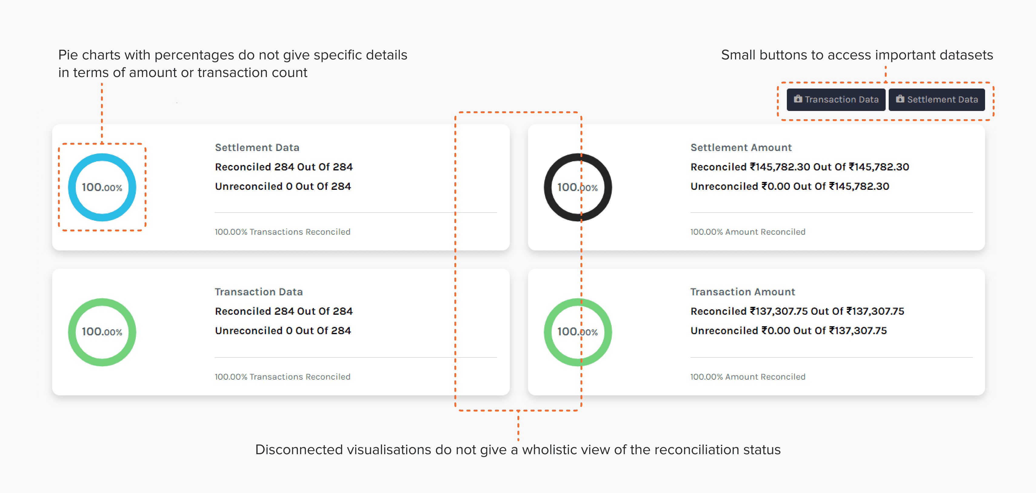
The main problem in the previous dashboard was unintuitive nature of the visualisation. The pie charts displayed percentages which did not make much sense to the people actually using the product. They needed values in terms of transaction counts or amounts. Also the data being visualised has a flow and connections in it, which is not reflected in the visualisation. Transactions and settlements form a mapped dataset, but they were segregated in different tabs.
After analysing the problems we brainstormed some ideas to . The head of the product team had a concept in mind about the type of visualisation, he referred to the google analytics funnels and that is where we started our secondary research.
Scope
Scope
Scope
The scope of this project is limited to intuitive and accessible visualisation of the data. This does not include how the data is fed in the system or how is it fetched from multiple sources. Also setting up the fees and rules for different sources is not covered in this project.
The scope of this project is limited to intuitive and accessible visualisation of the data. This does not include how the data is fed in the system or how is it fetched from multiple sources. Also setting up the fees and rules for different sources is not covered in this project.
The scope of this project is limited to intuitive and accessible visualisation of the data. This does not include how the data is fed in the system or how is it fetched from multiple sources. Also setting up the fees and rules for different sources is not covered in this project.
RESEARCH
RESEARCH
RESEARCH
Focus: Understanding how accountants and finance managers reconcile transactions and settlements, what tools do they use and what are they looking for in the complete dataset.
The research was conducted in two parts:
Secondary research: In this part which we studied how data visualisation works, how datasets similar to ours are being visualised and how we could do it more efficiently. We also did a competitive survey to find if any product that showcases a similar idea through a dashboard. But we could not find anything that was free and open to access.
Primary research: In this part we talked to the people who used the previous dashboard, some potential new users who had expressed needs regarding reconciliation services and the development team of the previous dashboard.
Secondary Research
Secondary Research
Secondary Research
We started by looking at what datasets were we dealing with and what are the most appropriate visualisations for the given data. Reconciliation of data happens between in-house transaction data and settlement data from some other party, so there is a categorical mapping and flow in the data. To map this type of data either expandable pie charts or funnel charts or Sankey diagrams can be used. This validated the initial idea of funnel charts since funnel charts are Sankey diagrams for simple, linear flows. We found a good example of funnel charts on Atlassian Marketplace by Kanbananalytics. This became the main reference of the interface for rest of the project.
We started by looking at what datasets were we dealing with and what are the most appropriate visualisations for the given data. Reconciliation of data happens between in-house transaction data and settlement data from some other party, so there is a categorical mapping and flow in the data. To map this type of data either expandable pie charts or funnel charts or Sankey diagrams can be used. This validated the initial idea of funnel charts since funnel charts are Sankey diagrams for simple, linear flows. We found a good example of funnel charts on Atlassian Marketplace by Kanbananalytics. This became the main reference of the interface for rest of the project.
We started by looking at what datasets were we dealing with and what are the most appropriate visualisations for the given data. Reconciliation of data happens between in-house transaction data and settlement data from some other party, so there is a categorical mapping and flow in the data. To map this type of data either expandable pie charts or funnel charts or Sankey diagrams can be used. This validated the initial idea of funnel charts since funnel charts are Sankey diagrams for simple, linear flows. We found a good example of funnel charts on Atlassian Marketplace by Kanbananalytics. This became the main reference of the interface for rest of the project.

Primary Research
Primary Research
Primary Research
We first talked to 2 people from the product team that developed the reconciliation dashboard, to understand what was the vision behind the dashboard and how the dashboard works currently. Then we conducted 2 interviews with people who had used the dashboard previously to understand how they used it and which features were they looking after the most. We also talked with 2 people who had actively asked about reconciliation product to understand what their needs were. From this we learnt about diversity in businesses and how it affects workflow. There are differences in flows and terminologies but at it's roots the conceptual model of the reconciliation process is the same.
Target Audience: The main audience for this product were higher level finance officials like CFOs, finance and accounting managers and also the ground level accountants. The main insights that we gained from primary research are mentioned below.
Higher level finance officials looked at the overview of the reconciliation status to take decisions. They also filtered the data as per their requirement .
Accountants found it difficult to access different entries in datasets (mostly unreconciled and mismatch) involved in the flow using the existing tools.
Both of them needed the datasets, either in terms of transaction amount or count. They would also like an overview of the reconciliation status in figures.
Based on these we started the ideating the visualisation and the dashboard.
Based on these we started the ideating the visualisation and the dashboard.
Based on these we started the ideating the visualisation and the dashboard.
IDEATION
IDEATION
IDEATION
We started ideation in two parts
Visualisation: The actual visualisation of the data and its functionality.
Dashboard: The dashboard, its features and functionalities.
We started ideation in two parts
Visualisation: The actual visualisation of the data and its functionality.
Dashboard: The dashboard, its features and functionalities.
We started ideation in two parts
Visualisation: The actual visualisation of the data and its functionality.
Dashboard: The dashboard, its features and functionalities.
Visualisation
Visualisation
Visualisation
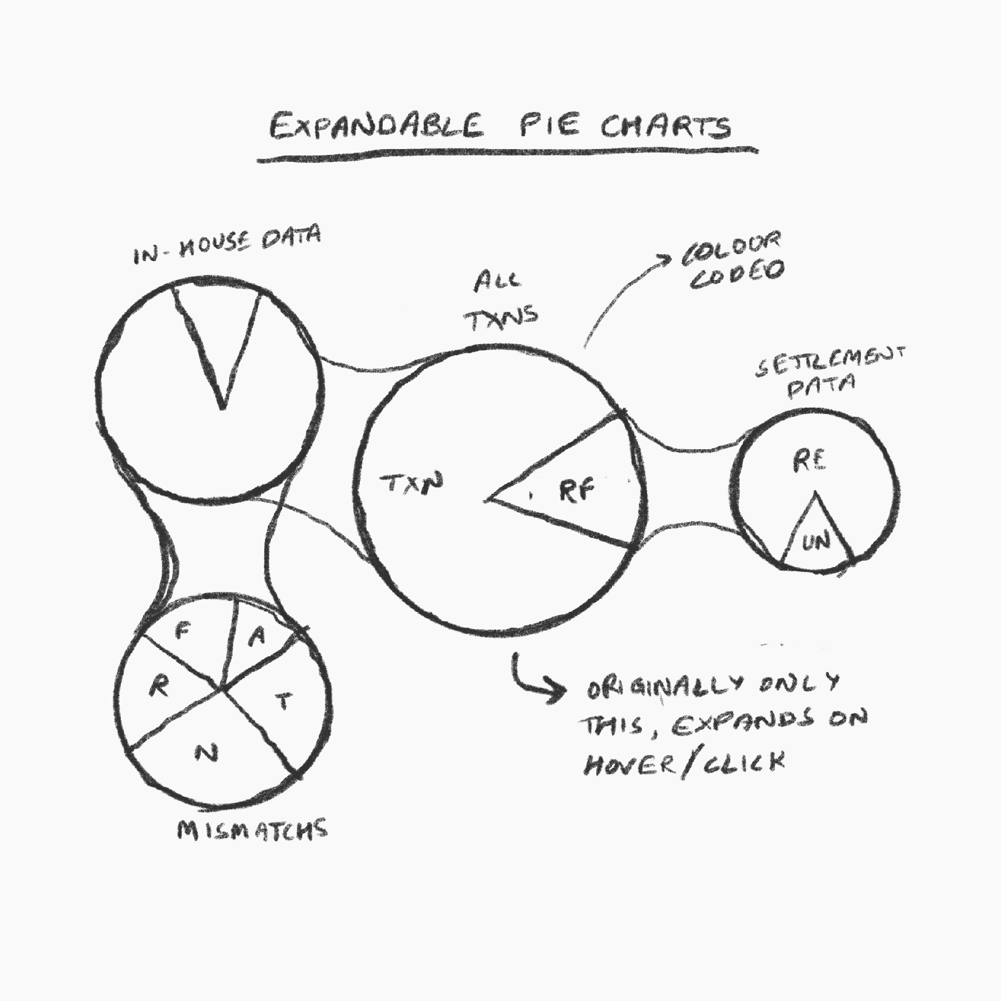
Backed by secondary research we started ideating on the expandable pie charts and funnel charts. Then we analysed both the concepts, took review from the product team and chose funnel charts as the way to go forward. I have explained the decision below
Backed by secondary research we started ideating on the expandable pie charts and funnel charts. Then we analysed both the concepts, took review from the product team and chose funnel charts as the way to go forward. I have explained the decision below
Backed by secondary research we started ideating on the expandable pie charts and funnel charts. Then we analysed both the concepts, took review from the product team and chose funnel charts as the way to go forward. I have explained the decision below
Expandable Pie Charts
Expandable Pie Charts
Expandable Pie Charts
Pie charts are a good way to show categorisation, but integrating flow in them by putting them in an expandable way makes it difficult to grasp upon. It was also difficult to get an intuitive overview of the data as the visualisation was becoming clutterd and unstructured. Accessing the data in expandable manner is also difficult and creates more hassle.
Pie charts are a good way to show categorisation, but integrating flow in them by putting them in an expandable way makes it difficult to grasp upon. It was also difficult to get an intuitive overview of the data as the visualisation was becoming clutterd and unstructured. Accessing the data in expandable manner is also difficult and creates more hassle.
Pie charts are a good way to show categorisation, but integrating flow in them by putting them in an expandable way makes it difficult to grasp upon. It was also difficult to get an intuitive overview of the data as the visualisation was becoming clutterd and unstructured. Accessing the data in expandable manner is also difficult and creates more hassle.
Funnel Charts
Funnel Charts
Funnel Charts
Funnel charts are a good way to show flows. Categorisation could be integrated in them by splitting columns. Since the funnels charts are right there, it is easy to grasp the overview of the reconciliation. Also colour coding in them could help in making the flow more intuitive. Accessing the data could be made accessible by selecting the columns.
Funnel charts are a good way to show flows. Categorisation could be integrated in them by splitting columns. Since the funnels charts are right there, it is easy to grasp the overview of the reconciliation. Also colour coding in them could help in making the flow more intuitive. Accessing the data could be made accessible by selecting the columns.

Dashboard
Dashboard
Dashboard
Then we started to brainstorm on what features were needed for the dashboard.
Filters
Timeframe: calendar, to choose specific date or time range
Channel: payment, delivery and e-commerce channels, auto chosen as per the merchant
Methods: applies for payment methods only, will not be there in delivery and e-commerce cases
Sub-methods: applies for payment methods only, will not be there in delivery and e-commerce
Amount-Count switch: A switch to change the mode of data between transaction amount and transaction count
Visualisation: A clickable funnel chart with columns for orders, transactions, settlements and mismatches
Table: A table showing a few entries from the selected dataset, all recent transactions. Also has a download button.

PROTOTYPING
PROTOTYPING
PROTOTYPING
After an clear enough idea was formed, I started the final layout and prototyping of the dashboard. It went through multiple iterations after reviews from guides and product teams.
After an clear enough idea was formed, I started the final layout and prototyping of the dashboard. It went through multiple iterations after reviews from guides and product teams.
After an clear enough idea was formed, I started the final layout and prototyping of the dashboard. It went through multiple iterations after reviews from guides and product teams.
Version 1
Version 1
Version 1
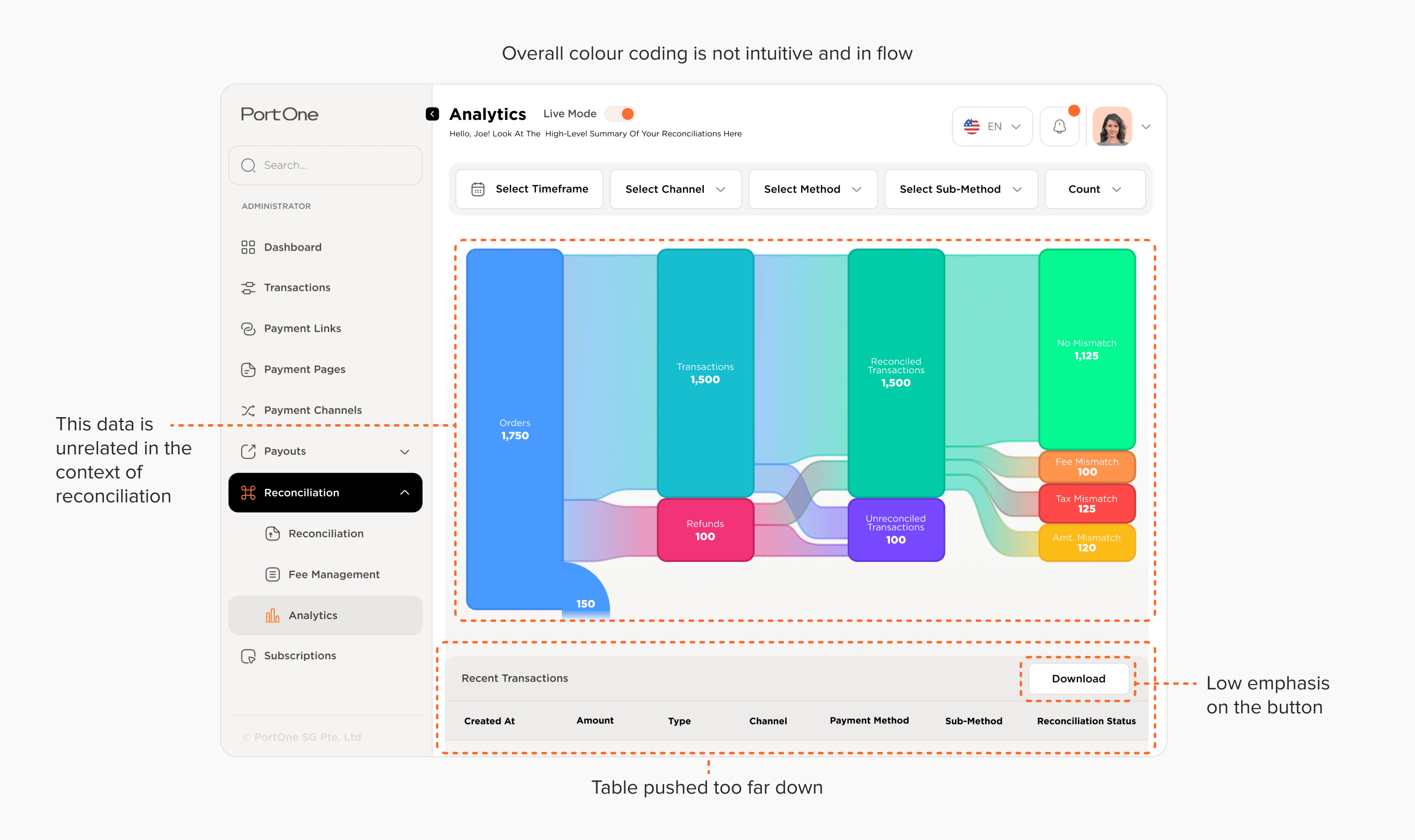
I made the first version which is shown above. It had a few issues like wrong UI elements, bad hierarchy and emphasis using layouts.
I made the first version which is shown above. It had a few issues like wrong UI elements, bad hierarchy and emphasis using layouts.
I made the first version which is shown above. It had a few issues like wrong UI elements, bad hierarchy and emphasis using layouts.
Version 2
Version 2
Version 2
I fixed the issue that came out of reviews of version 1 and added some more things like column titles, clicked states on the buttons in the chart, a filter status indication at the bottom of the chart.
I fixed the issue that came out of reviews of version 1 and added some more things like column titles, clicked states on the buttons in the chart, a filter status indication at the bottom of the chart.
I fixed the issue that came out of reviews of version 1 and added some more things like column titles, clicked states on the buttons in the chart, a filter status indication at the bottom of the chart.

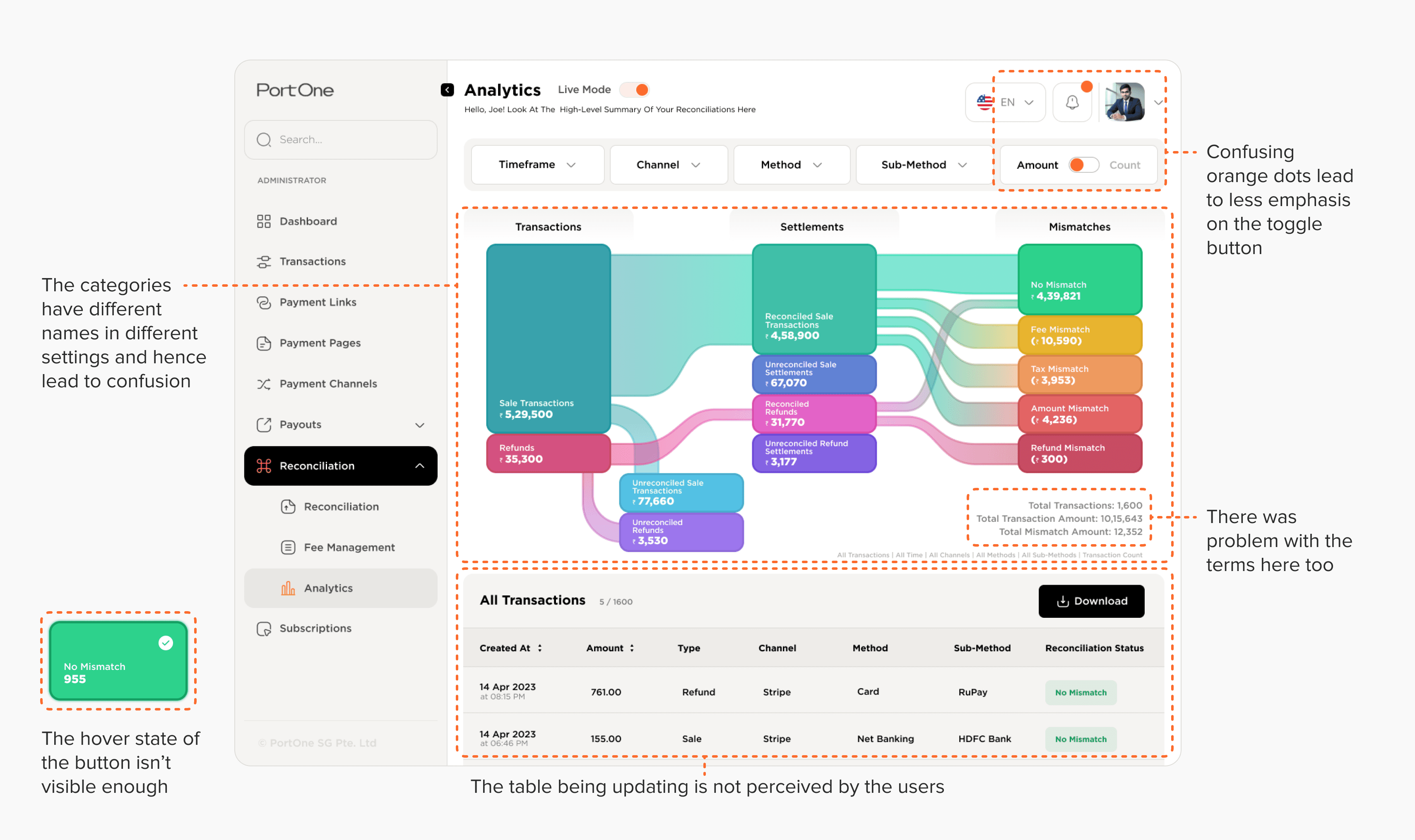
The second version had some minor UI element problems, but a major problem about the categorisation in the funnel chart came up during review. The categories felt unintuitive to difficult to access. Also connections that had not yet happened between the data were shoen from before, which is not accurate.
The second version had some minor UI element problems, but a major problem about the categorisation in the funnel chart came up during review. The categories felt unintuitive to difficult to access. Also connections that had not yet happened between the data were shoen from before, which is not accurate.
The second version had some minor UI element problems, but a major problem about the categorisation in the funnel chart came up during review. The categories felt unintuitive to difficult to access. Also connections that had not yet happened between the data were shoen from before, which is not accurate.
Version 3
Version 3
Version 3
The issue with categories of the data and connections between them was fixed in this version. I also added more information in figures as it was important for the end users. Also fixed the issues with other UI elements.
The issue with categories of the data and connections between them was fixed in this version. I also added more information in figures as it was important for the end users. Also fixed the issues with other UI elements.
The issue with categories of the data and connections between them was fixed in this version. I also added more information in figures as it was important for the end users. Also fixed the issues with other UI elements.
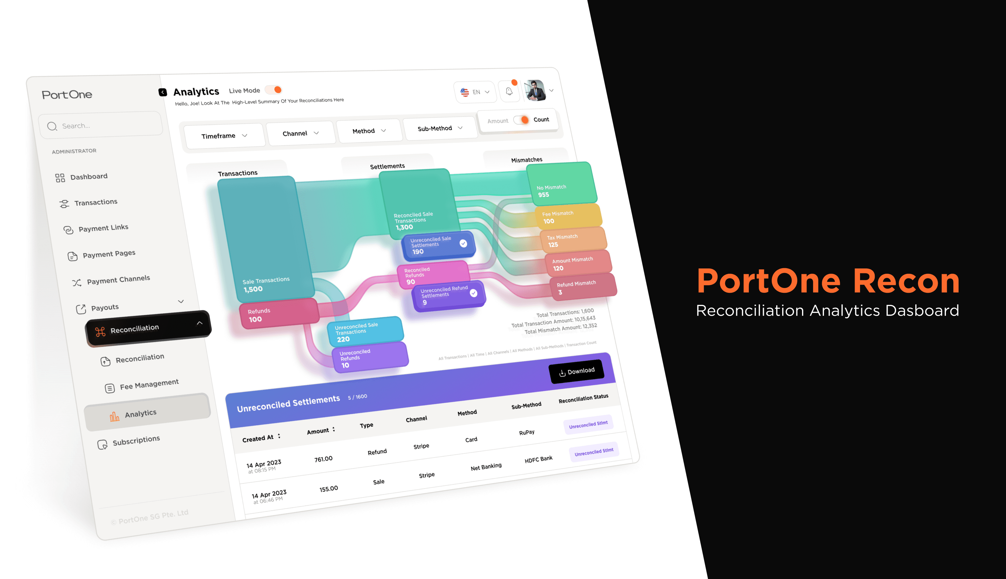
This version fixed most of the issues that we had encountered during internal reviews. Then after complete prototyping of this version we did a round of user testing.
Added the prototype screenshot just because it looks like my brain which was not existing anymore after completing this prototype.
This version fixed most of the issues that we had encountered during internal reviews. Then after complete prototyping of this version we did a round of user testing.
Added the prototype screenshot just because it looks like my brain which was not existing anymore after completing this prototype.
This version fixed most of the issues that we had encountered during internal reviews. Then after complete prototyping of this version we did a round of user testing.
Added the prototype screenshot just because it looks like my brain which was not existing anymore after completing this prototype.
USER TESTING
USER TESTING
USER TESTING
We started by recruiting users belonging to the target audience demographic. We used the think aloud method and user feedback for evaluation of the interface of the dashboard. We also took notes in the background. Users were given context according to the way they were interacting with the dashboard. We could conduct testing sessions with four users in a formal way and four users in an informal way. These are the insights that we got from them.
We started by recruiting users belonging to the target audience demographic. We used the think aloud method and user feedback for evaluation of the interface of the dashboard. We also took notes in the background. Users were given context according to the way they were interacting with the dashboard. We could conduct testing sessions with four users in a formal way and four users in an informal way. These are the insights that we got from them.
We started by recruiting users belonging to the target audience demographic. We used the think aloud method and user feedback for evaluation of the interface of the dashboard. We also took notes in the background. Users were given context according to the way they were interacting with the dashboard. We could conduct testing sessions with four users in a formal way and four users in an informal way. These are the insights that we got from them.
Then we analysed the insights, brainstormed ideas and proposed changes accordingly.
Then we analysed the insights, brainstormed ideas and proposed changes accordingly.
Then we analysed the insights, brainstormed ideas and proposed changes accordingly.
PROPOSED CHANGES
PROPOSED CHANGES
PROPOSED CHANGES
The key insights that we found from the testing sessions and the proposed solutions for them are mention below.
The key insights that we found from the testing sessions and the proposed solutions for them are mention below.
The key insights that we found from the testing sessions and the proposed solutions for them are mention below.
Clickability of boxes not apparent to users
Clickability of boxes not apparent to users
Clickability of boxes not apparent to users
Solution: Changing the color saturation of the box and increasing text size in the hover state.
Solution: Changing the color saturation of the box and increasing text size in the hover state.
Solution: Changing the color saturation of the box and increasing text size in the hover state.
Changes in table not apparent to user
Changes in table not apparent to user
Changes in table not apparent to user
Solution: Changing the colour of the table header according and adding intermediate loading animations before updating the table.
Solution: Changing the colour of the table header according and adding intermediate loading animations before updating the table.
Solution: Changing the colour of the table header according and adding intermediate loading animations before updating the table.
Greater transaction level detail required by user. More actionable features needed as well like assigning entries to accountants.
Greater transaction level detail required by user. More actionable features needed as well like assigning entries to accountants.
Greater transaction level detail required by user. More actionable features needed as well like assigning entries to accountants.
Solution: Display an overlay that shows mismatch details according to internal and external records.
Solution: Display an overlay that shows mismatch details according to internal and external records.
Solution: Display an overlay that shows mismatch details according to internal and external records.
Terminologies used were unfamiliar to all interviewees. These varied across every single interviewee.
Terminologies used were unfamiliar to all interviewees. These varied across every single interviewee.
Terminologies used were unfamiliar to all interviewees. These varied across every single interviewee.
Solution: Display a tooltip explaining the term on 'i' icon. Also give an option to edit the terminology.
Solution: Display a tooltip explaining the term on 'i' icon. Also give an option to edit the terminology.
Solution: Display a tooltip explaining the term on 'i' icon. Also give an option to edit the terminology.
Senior interviewees needed someway to import this chart to a powerpoint or other ways of presentation.
Senior interviewees needed someway to import this chart to a powerpoint or other ways of presentation.
Senior interviewees needed someway to import this chart to a powerpoint or other ways of presentation.
Solution: Export option current graphic on-screen to transparent .png, .svg, or .jpeg. Share to Email/Slack option.
Solution: Export option current graphic on-screen to transparent .png, .svg, or .jpeg. Share to Email/Slack option.
Solution: Export option current graphic on-screen to transparent .png, .svg, or .jpeg. Share to Email/Slack option.

We could not incorporate the assigning feature. After proposing these changes our project halted and the product development took over.
We could not incorporate the assigning feature. After proposing these changes our project halted and the product development took over.
We could not incorporate the assigning feature. After proposing these changes our project halted and the product development took over.
Presentations
Presentations
Presentations
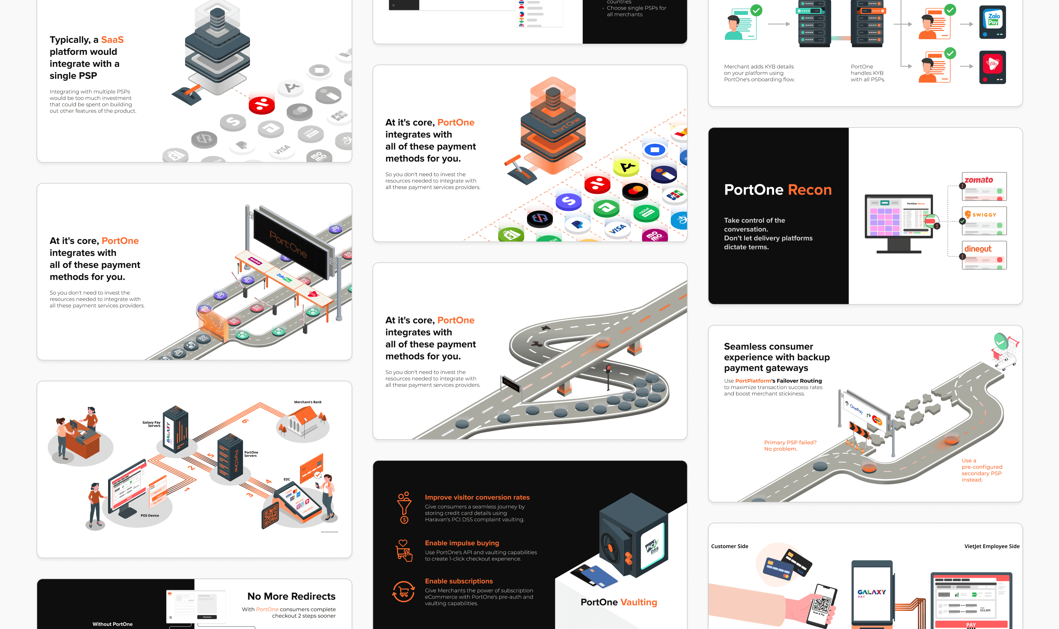
I also made some presentations during the internship. It was done to explain complex financial concept using metaphors. Have a look at some frames below.
I also made some presentations during the internship. It was done to explain complex financial concept using metaphors. Have a look at some frames below.
I also made some presentations during the internship. It was done to explain complex financial concept using metaphors. Have a look at some frames below.
Colophon
Colophon
Colophon
The font used in this project is Gotham. The main inspiration for the funnel charts was Funnels by Kanbananalytics. The icon library used for this project is IconSax.
The font used in this project is Gotham. The main inspiration for the funnel charts was Funnels by Kanbananalytics. The icon library used for this project is IconSax.
The font used in this project is Gotham. The main inspiration for the funnel charts was Funnels by Kanbananalytics. The icon library used for this project is IconSax.
Project Guide
Project Guide
Project Guide
Hemant Bothra
Man Singh
Raghav Rastogi
Hemant Bothra
Man Singh
Raghav Rastogi
Hemant Bothra
Man Singh
Raghav Rastogi
Thank You!
Thank You!
Thank You!
A sincere thanks to everyone who participated in the interviews and discussion regarding the project.
A sincere thanks to everyone who participated in the interviews and discussion regarding the project.
A sincere thanks to everyone who participated in the interviews and discussion regarding the project.