Summary
Summary
Summary
This project was part of an academic course, aimed at typesetting 'Why I am an Atheist' by Bhagat Singh in three different ways.
This project was part of an academic course, aimed at typesetting 'Why I am an Atheist' by Bhagat Singh in three different ways.
This project was part of an academic course, aimed at typesetting 'Why I am an Atheist' by Bhagat Singh in three different ways.
Duration
Duration
Duration
14 Days
14 Days
14 Days
Category
Category
Category
Typesetting, Illustration, Visual Communication, Printing
Typesetting, Illustration, Visual Communication, Printing
Typesetting, Illustration, Visual Communication, Printing
INTRODUCTION
INTRODUCTION
INTRODUCTION
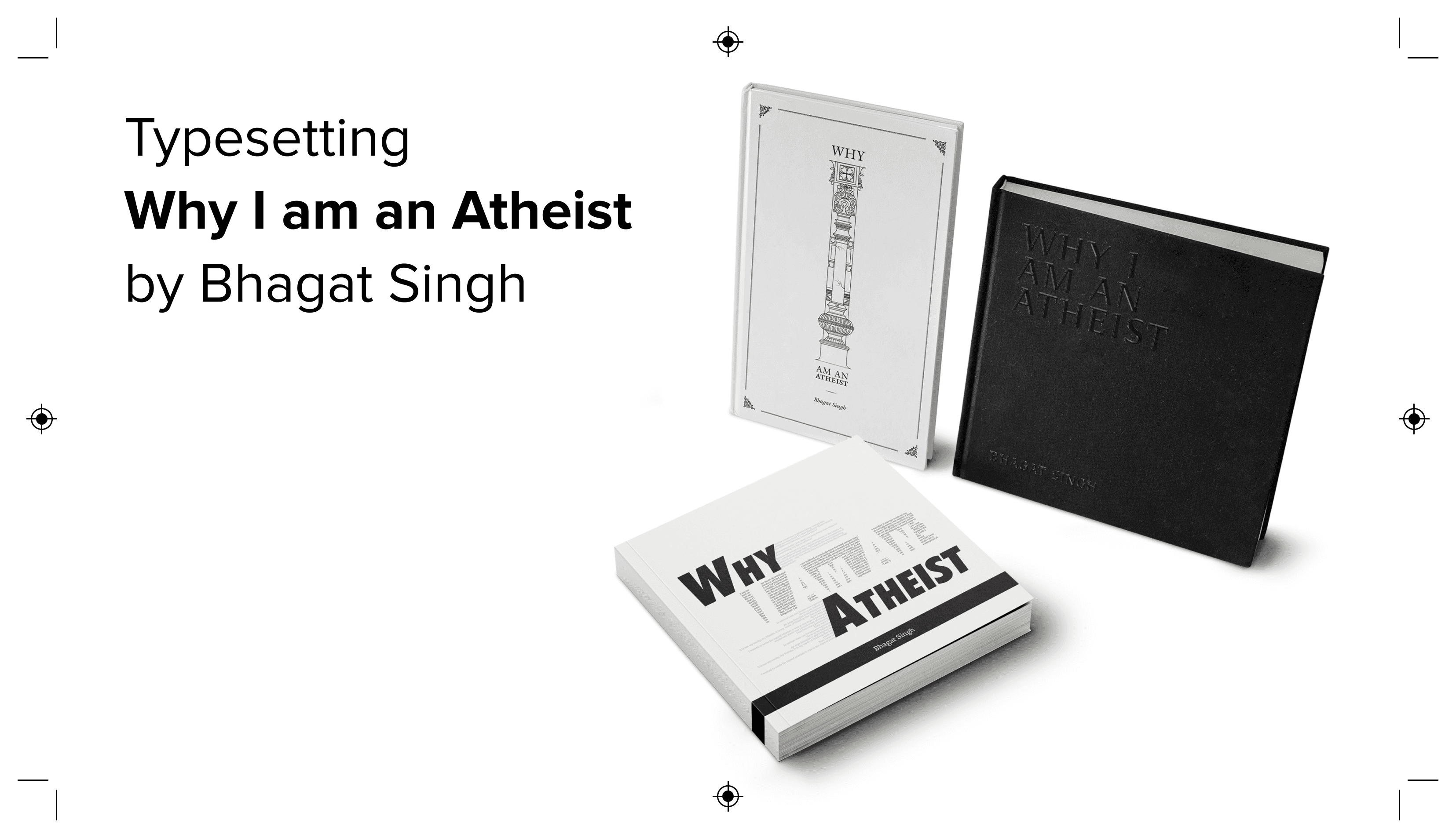
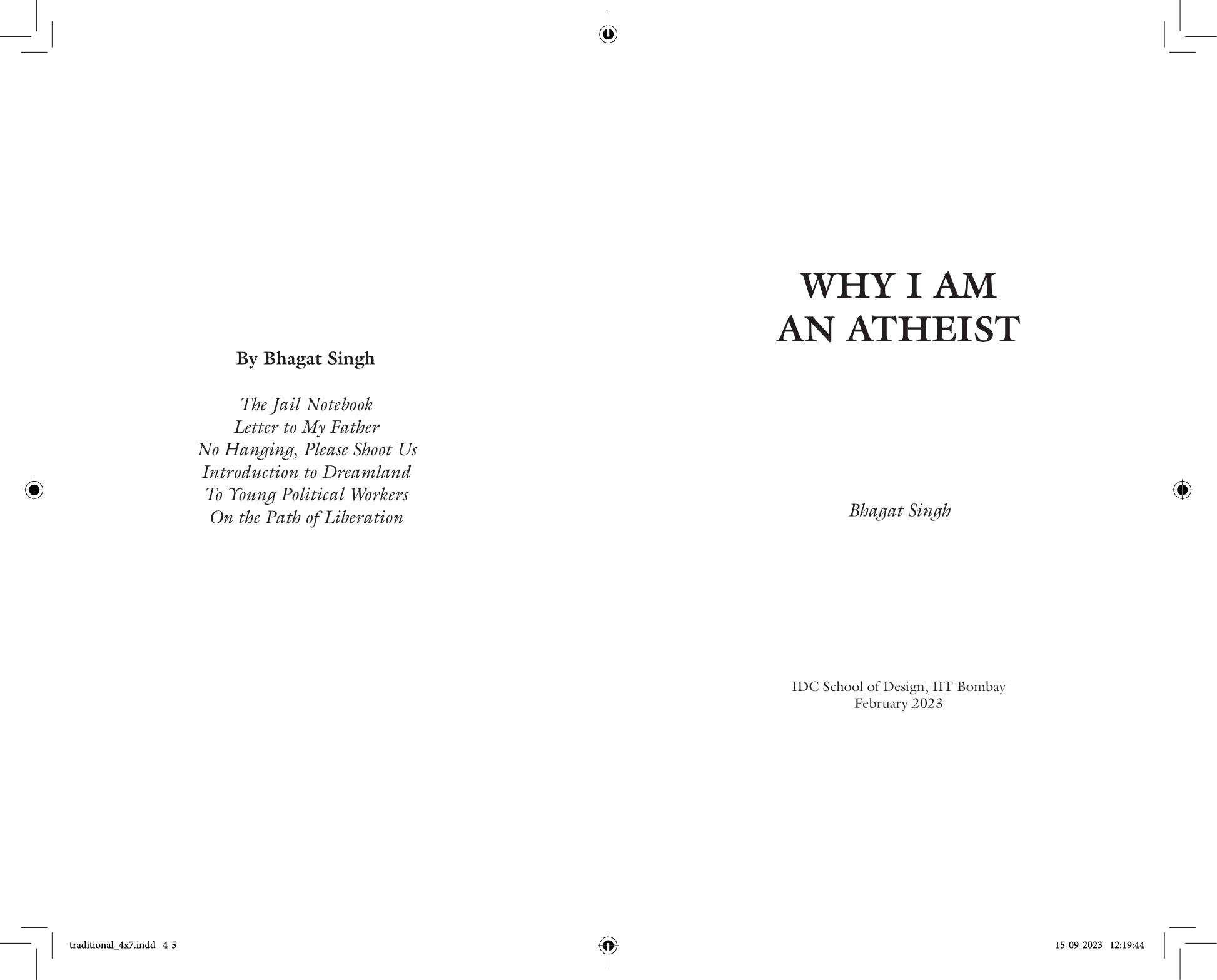
The aim of the project was to typeset the book Why I am an Atheist by Bhagat Singh in three ways — traditional, modern and experimental. I had to come up with different concepts which aligned with the content of the book, for each of the three types and reflect them in the covers and layouts of the books. I had also constrained myself to use only black and white, to fully focus on the layout and typesetting of the books.
The aim of the project was to typeset the book Why I am an Atheist by Bhagat Singh in three ways — traditional, modern and experimental. I had to come up with different concepts which aligned with the content of the book, for each of the three types and reflect them in the covers and layouts of the books. I had also constrained myself to use only black and white, to fully focus on the layout and typesetting of the books.
The aim of the project was to typeset the book Why I am an Atheist by Bhagat Singh in three ways — traditional, modern and experimental. I had to come up with different concepts which aligned with the content of the book, for each of the three types and reflect them in the covers and layouts of the books. I had also constrained myself to use only black and white, to fully focus on the layout and typesetting of the books.
TRADITIONAL TYPESETTING
TRADITIONAL TYPESETTING
CONCEPT & SPECIFICATIONS
CONCEPT & SPECIFICATIONS
CONCEPT & SPECIFICATIONS
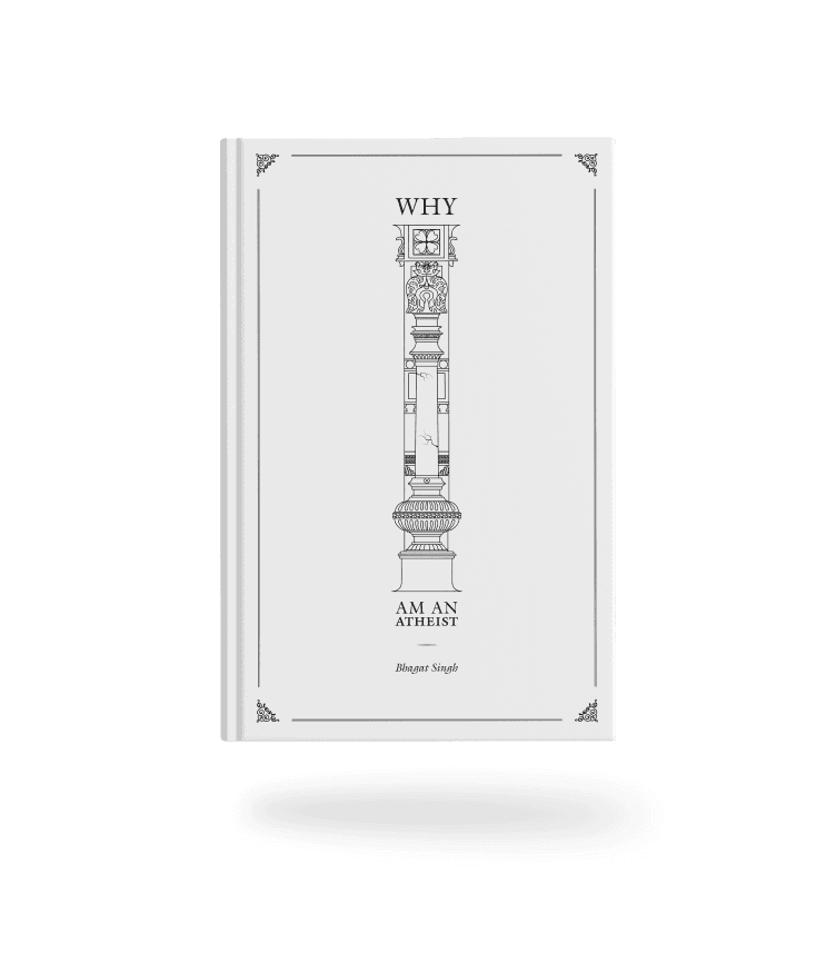
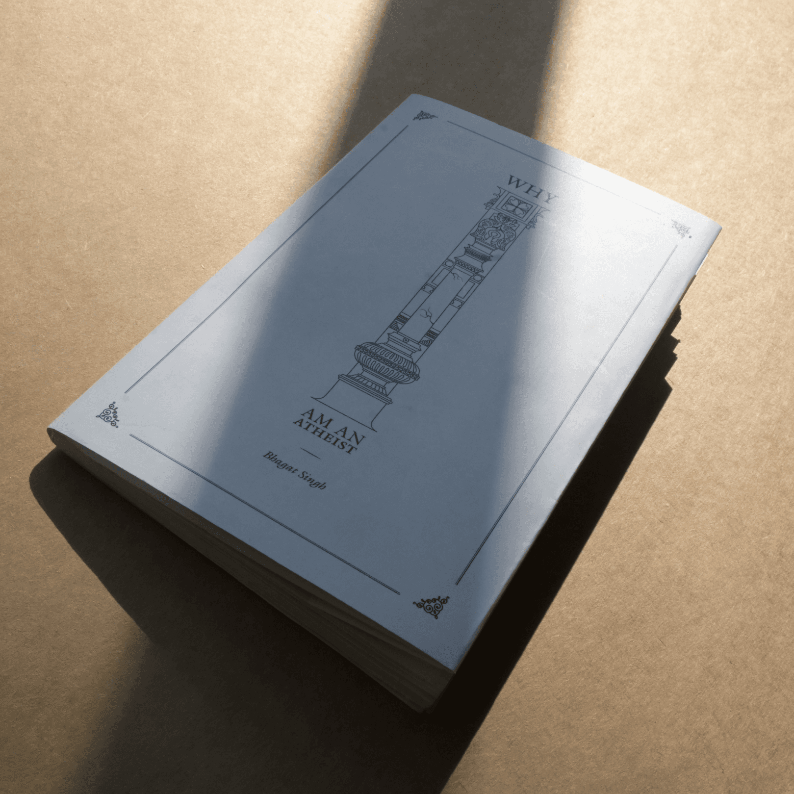
The pillar on the cover signified the foundation of theism on which the two cracks represented the two arguments that Bhagat Singh. The pillar is still standing due to it's strong foundations even though there are cracks in it. It also represents 'I' i.e. Bhagat Singh who was firm as a pillar on his views of religion. The book was typeset in 10.5/14 pt ITC Galliard (designed by Matthew Carter), an old-style serif typeface. It was printed on 120 GSM bone white paper. A standard traditional margin system was used on a 4x7 inch paper size.
The pillar on the cover signified the foundation of theism on which the two cracks represented the two arguments that Bhagat Singh. The pillar is still standing due to it's strong foundations even though there are cracks in it. It also represents 'I' i.e. Bhagat Singh who was firm as a pillar on his views of religion. The book was typeset in 10.5/14 pt ITC Galliard (designed by Matthew Carter), an old-style serif typeface. It was printed on 120 GSM bone white paper. A standard traditional margin system was used on a 4x7 inch paper size.
The pillar on the cover signified the foundation of theism on which the two cracks represented the two arguments that Bhagat Singh. The pillar is still standing due to it's strong foundations even though there are cracks in it. It also represents 'I' i.e. Bhagat Singh who was firm as a pillar on his views of religion. The book was typeset in 10.5/14 pt ITC Galliard (designed by Matthew Carter), an old-style serif typeface. It was printed on 120 GSM bone white paper. A standard traditional margin system was used on a 4x7 inch paper size.
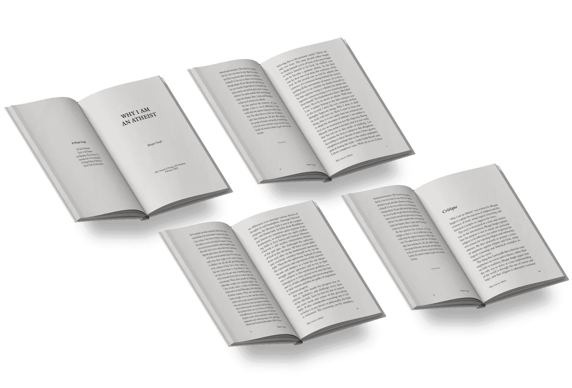
SPREADS
SPREADS
SPREADS

MODERN TYPESETTING
MODERN TYPESETTING

CONCEPT & SPECIFICATIONS
CONCEPT & SPECIFICATIONS
CONCEPT & SPECIFICATIONS
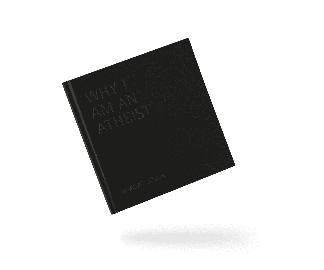
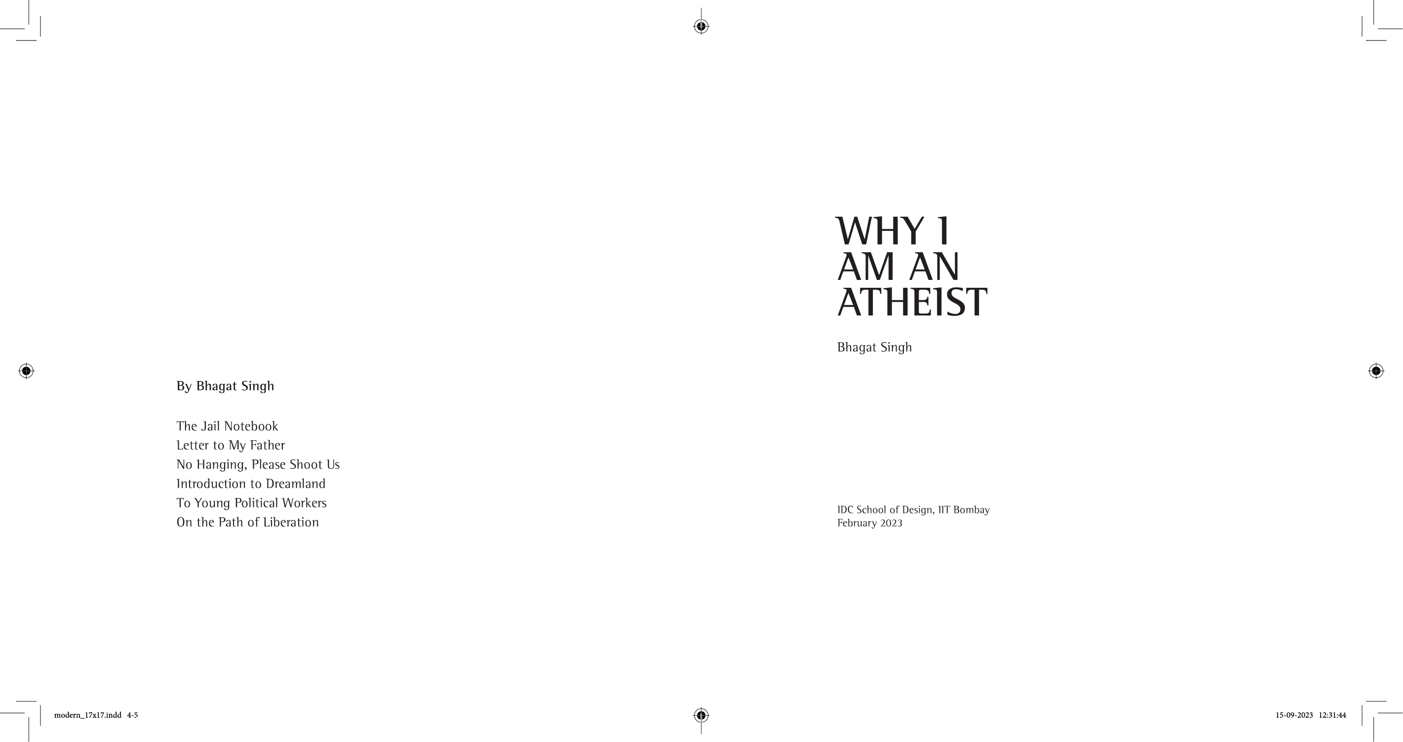
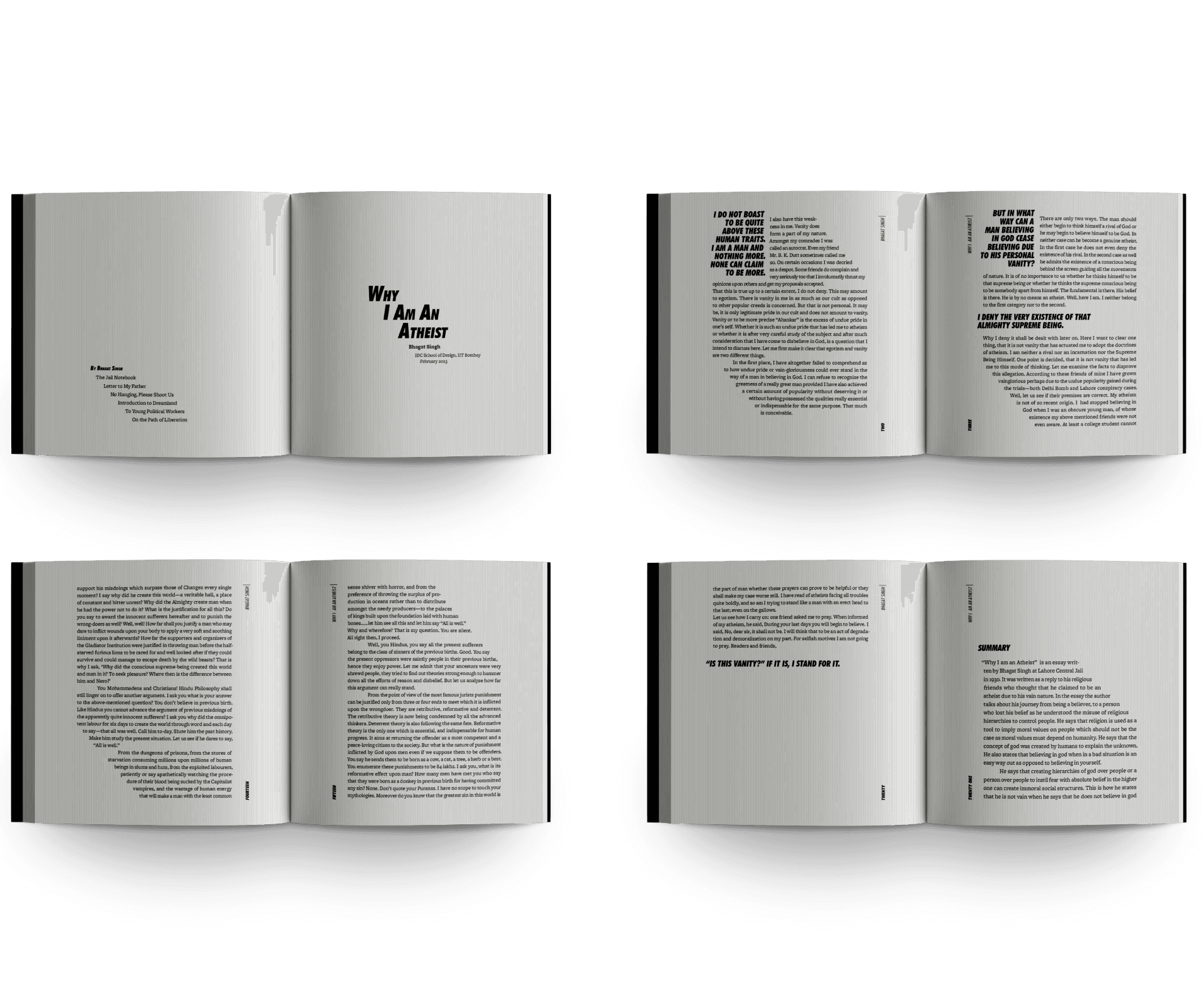
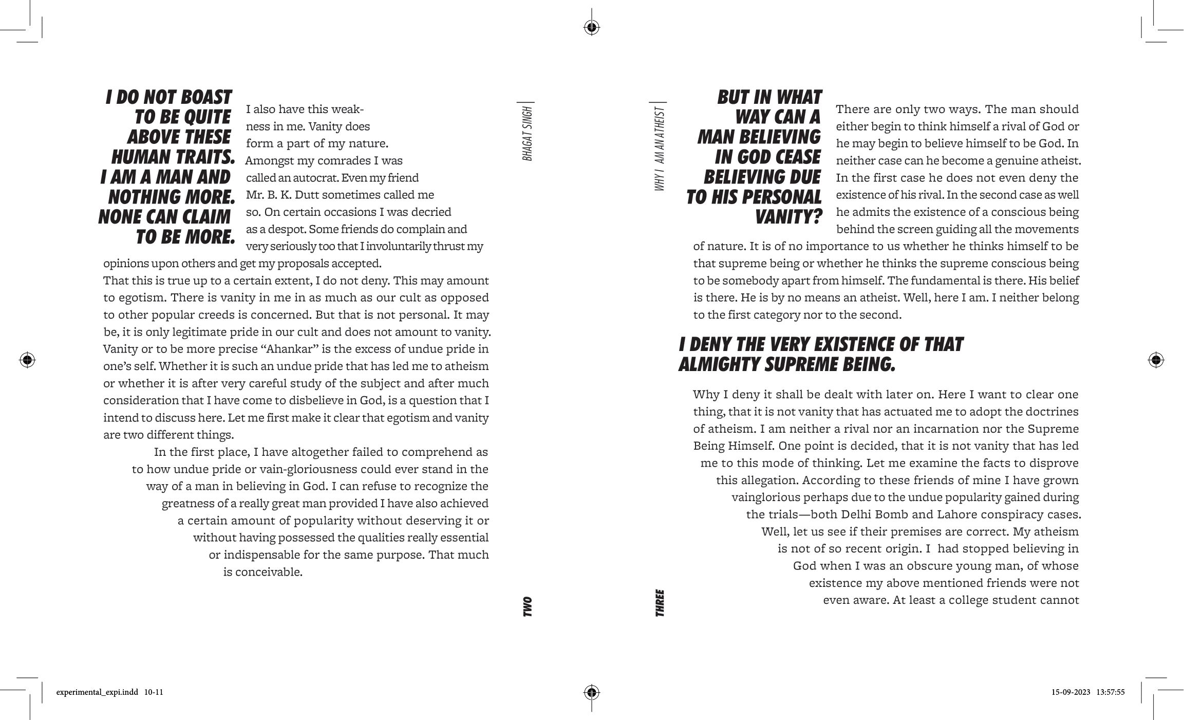
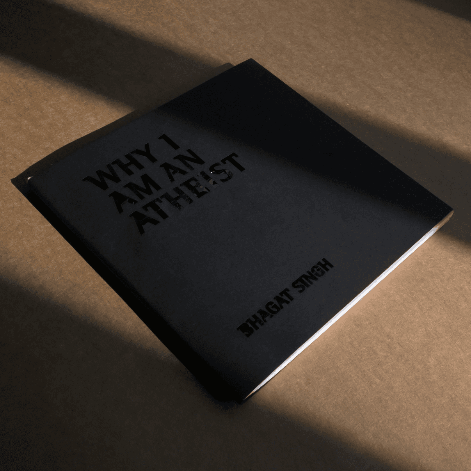
The concept of the cover, black on black was based on the content of the book in which the author is trying to find some light in the darkness. It was supposed to be UV spot printed, but due to limited requirement it was done with a stencil. The book was typeset in 10/14 pt Rotis Semi Serif (designed by Otl Aicher), a modern typeface with a unique character. It was printed on 160 GSM PT White paper. A two column grid was used with ample white space to enhance the modern character of the book. The size of the book is 6.7x6.7 inches.
The concept of the cover, black on black was based on the content of the book in which the author is trying to find some light in the darkness. It was supposed to be UV spot printed, but due to limited requirement it was done with a stencil. The book was typeset in 10/14 pt Rotis Semi Serif (designed by Otl Aicher), a modern typeface with a unique character. It was printed on 160 GSM PT White paper. A two column grid was used with ample white space to enhance the modern character of the book. The size of the book is 6.7x6.7 inches.
The concept of the cover, black on black was based on the content of the book in which the author is trying to find some light in the darkness. It was supposed to be UV spot printed, but due to limited requirement it was done with a stencil. The book was typeset in 10/14 pt Rotis Semi Serif (designed by Otl Aicher), a modern typeface with a unique character. It was printed on 160 GSM PT White paper. A two column grid was used with ample white space to enhance the modern character of the book. The size of the book is 6.7x6.7 inches.
SPREADS

EXPERIMENTAL TYPESETTING
EXPERIMENTAL TYPESETTING

CONCEPT & SPECIFICATIONS
CONCEPT & SPECIFICATIONS
CONCEPT & SPECIFICATIONS
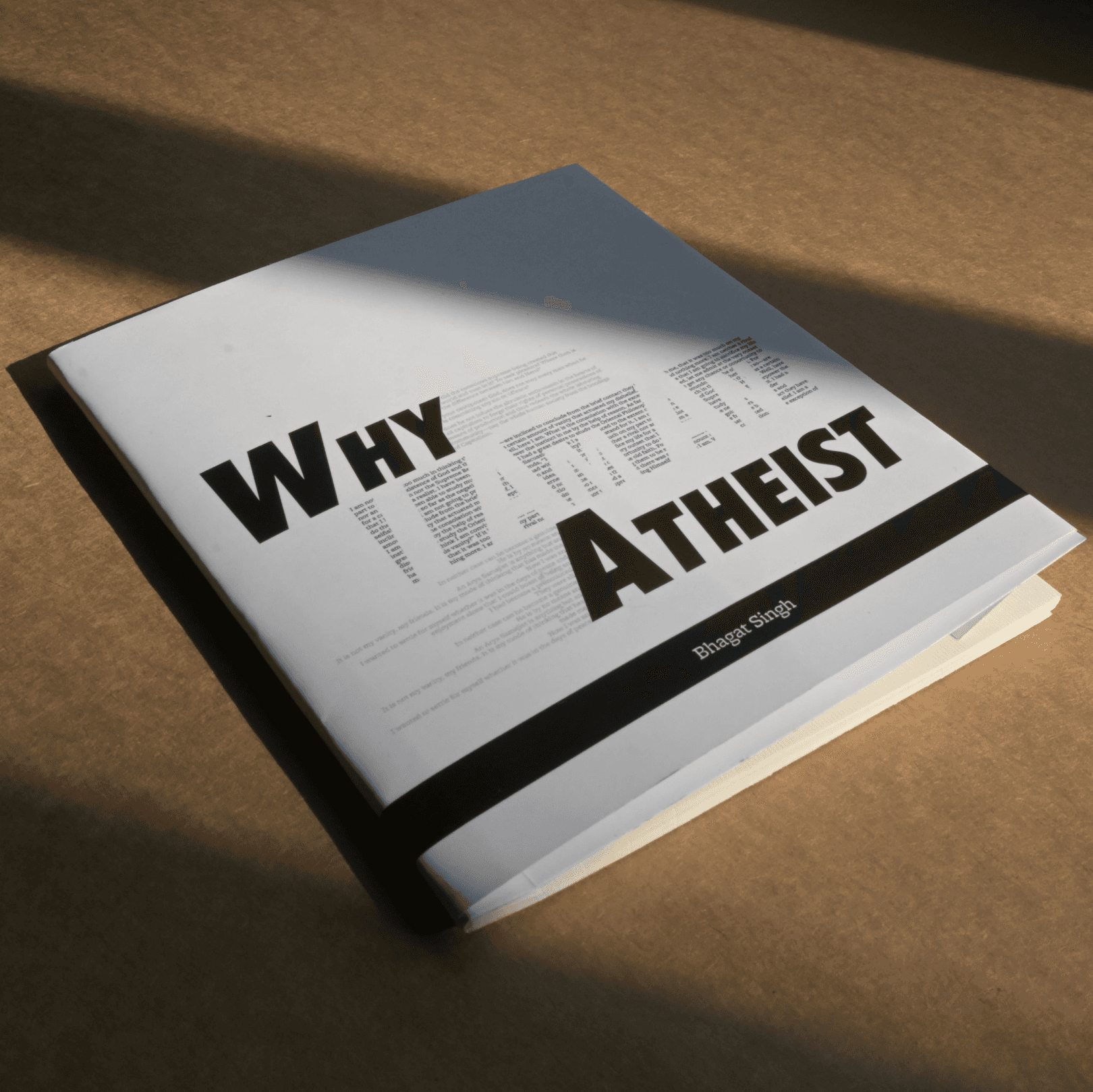
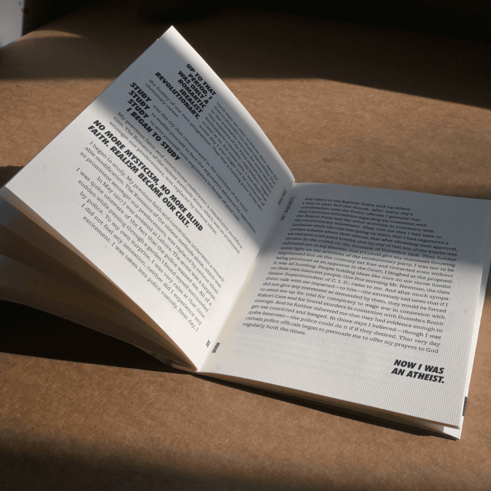
The concept of the book was that the highlighted text can be rapidly read to understand the gist of what the author is trying to communicate. Using a slant angle in text was done to show the flow in which the author is communicating. The book was typeset in 9/12 pt Freight Micro Text (designed by Joshua Darden), a modern serif typeface and Futura Extra Bold Condensed Oblique, a classic geometric typeface. It was printed on 120 GSM textured paper. The aspect ratio of the book is the ratio e:π.
The concept of the book was that the highlighted text can be rapidly read to understand the gist of what the author is trying to communicate. Using a slant angle in text was done to show the flow in which the author is communicating. The book was typeset in 9/12 pt Freight Micro Text (designed by Joshua Darden), a modern serif typeface and Futura Extra Bold Condensed Oblique, a classic geometric typeface. It was printed on 120 GSM textured paper. The aspect ratio of the book is the ratio e:π.
The concept of the book was that the highlighted text can be rapidly read to understand the gist of what the author is trying to communicate. Using a slant angle in text was done to show the flow in which the author is communicating. The book was typeset in 9/12 pt Freight Micro Text (designed by Joshua Darden), a modern serif typeface and Futura Extra Bold Condensed Oblique, a classic geometric typeface. It was printed on 120 GSM textured paper. The aspect ratio of the book is the ratio e:π.

PRINTED BOOKS
PRINTED BOOKS


Colophon
Colophon
Colophon
The fonts used in this project are mentioned in the specifications of each book. The tool used for this project is Adobe Indesign.
The fonts used in this project are mentioned in the specifications of each book. The tool used for this project is Adobe Indesign.
The fonts used in this project are mentioned in the specifications of each book. The tool used for this project is Adobe Indesign.
Project Guide
Project Guide
Project Guide
Prof. Girish Dalvi
Prof. Girish Dalvi
Prof. Girish Dalvi
Course
Course
Course
DE202 | 2D Visual Studies
DE202 | 2D Visual Studies
DE202 | 2D Visual Studies