Summary
Summary
Summary
This project was an academic group project, aimed at understanding the interaction design method through user studies and concept design.
This project was an academic group project, aimed at understanding the interaction design method through user studies and concept design.
This project was an academic group project, aimed at understanding the interaction design method through user studies and concept design.
Duration
Duration
Duration
3 Weeks
3 Weeks
3 Weeks
Category
Category
Category
User Studies, Interaction Design, Interface Design
User Studies, Interaction Design, Interface Design
User Studies, Interaction Design, Interface Design
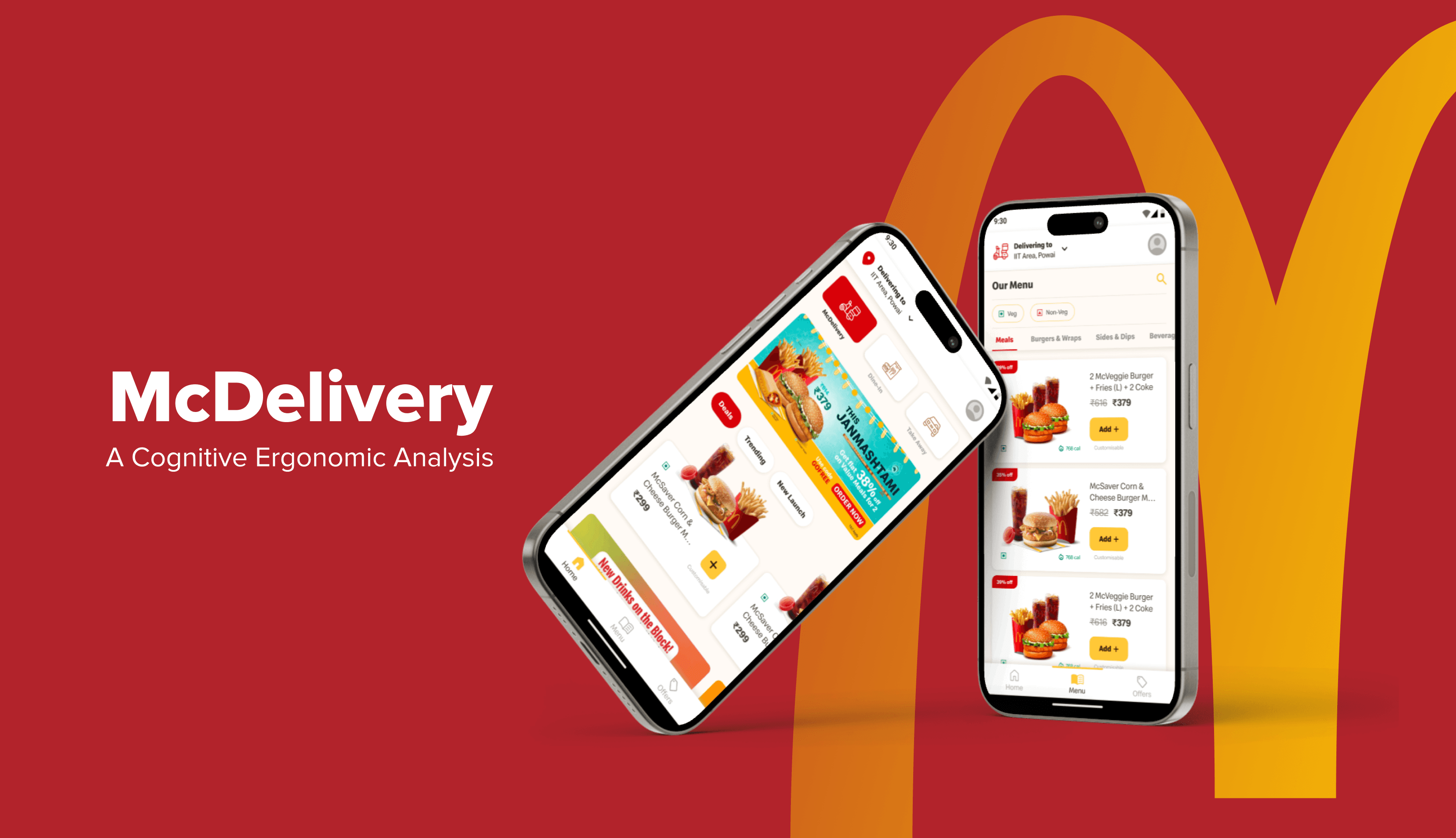
ABOUT
ABOUT
ABOUT
The McDelivery India - West and South application is a web and mobile app offered by McDonald's, one of the world's largest fast-food chains. The app allows customers in West and South India to conveniently order their favourite McDonald's menu items for home delivery, dine-in, take-away and on-the-go. Users can browse the menu, customise their orders, and make payments through the app. It often offers special promotions and discounts to attract customers. McDonald’s also provides another application globally to redeem offers for dine-in, drive-thru and delivery.
The McDelivery India - West and South application is a web and mobile app offered by McDonald's, one of the world's largest fast-food chains. The app allows customers in West and South India to conveniently order their favourite McDonald's menu items for home delivery, dine-in, take-away and on-the-go. Users can browse the menu, customise their orders, and make payments through the app. It often offers special promotions and discounts to attract customers. McDonald’s also provides another application globally to redeem offers for dine-in, drive-thru and delivery.
The McDelivery India - West and South application is a web and mobile app offered by McDonald's, one of the world's largest fast-food chains. The app allows customers in West and South India to conveniently order their favourite McDonald's menu items for home delivery, dine-in, take-away and on-the-go. Users can browse the menu, customise their orders, and make payments through the app. It often offers special promotions and discounts to attract customers. McDonald’s also provides another application globally to redeem offers for dine-in, drive-thru and delivery.
Purpose
Purpose
Purpose
The McDelivery application is used rarely even after offering many discounts on the app. People generally prefer to order McDonalds via Swiggy or Zomato because of poor experience on the McDelivery app. The purpose of this study is to evaluate the usability of the McDelivery application and suggest meaningful changes that could help improve the user experience of the application.
The McDelivery application is used rarely even after offering many discounts on the app. People generally prefer to order McDonalds via Swiggy or Zomato because of poor experience on the McDelivery app. The purpose of this study is to evaluate the usability of the McDelivery application and suggest meaningful changes that could help improve the user experience of the application.
The McDelivery application is used rarely even after offering many discounts on the app. People generally prefer to order McDonalds via Swiggy or Zomato because of poor experience on the McDelivery app. The purpose of this study is to evaluate the usability of the McDelivery application and suggest meaningful changes that could help improve the user experience of the application.
Objective
Objective
Objective
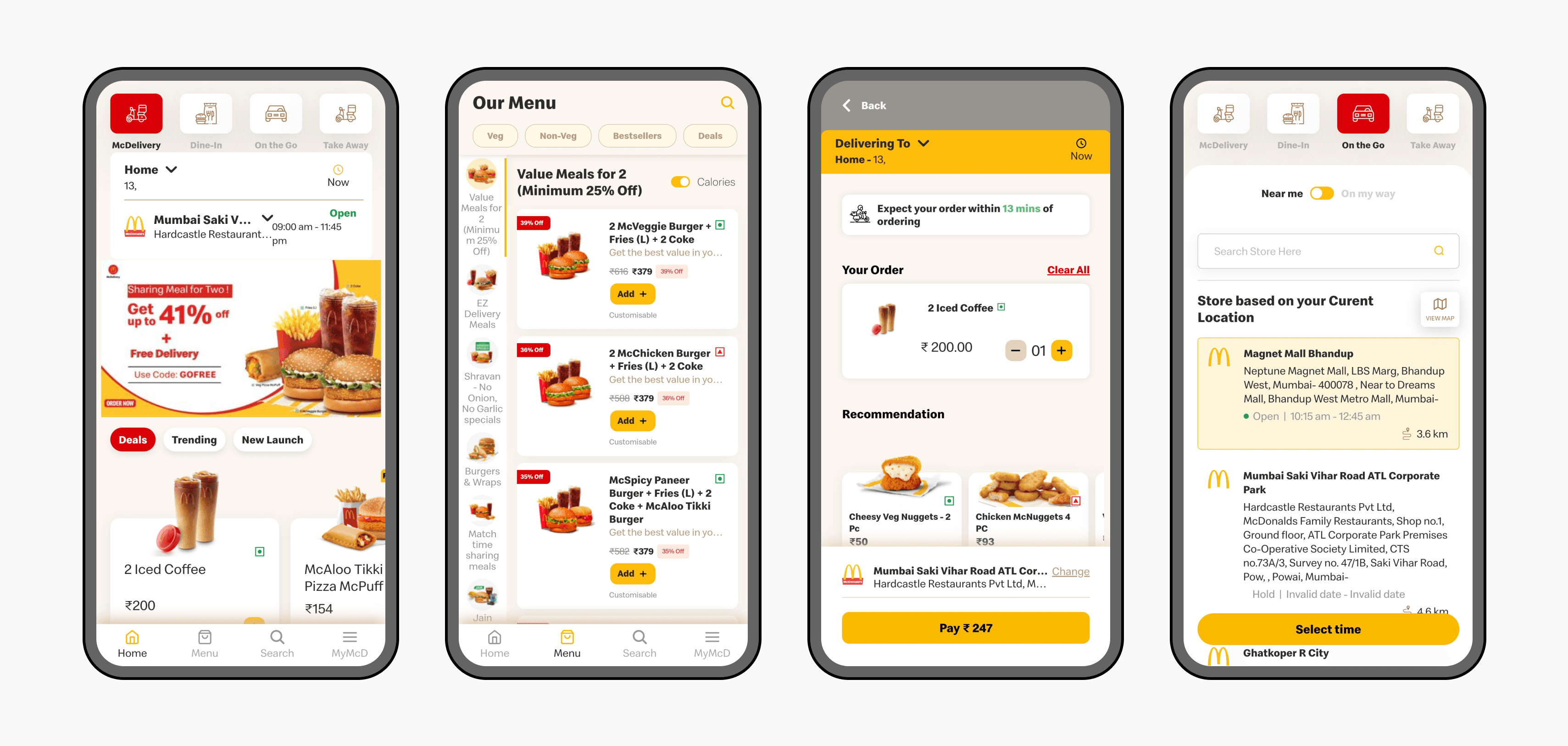
The objective of the study is to assess the ergonomics of McDelivery application in terms of cognitive load, efficiency, effectiveness and satisfaction of the users. Given below is the current version of the McDelivery app.
The objective of the study is to assess the ergonomics of McDelivery application in terms of cognitive load, efficiency, effectiveness and satisfaction of the users. Given below is the current version of the McDelivery app.
The objective of the study is to assess the ergonomics of McDelivery application in terms of cognitive load, efficiency, effectiveness and satisfaction of the users. Given below is the current version of the McDelivery app.
ANALYSIS
ANALYSIS
ANALYSIS
We decided to analyse the McDelivery application using different methods to understand majority of the aspects regarding usability. The methods used for the study are mentioned below.
We decided to analyse the McDelivery application using different methods to understand majority of the aspects regarding usability. The methods used for the study are mentioned below.
We decided to analyse the McDelivery application using different methods to understand majority of the aspects regarding usability. The methods used for the study are mentioned below.
Defining Tasks
Defining Tasks
Defining Tasks
HTA
Hierarchical Task Analysis
HTA
Hierarchical Task Analysis
HTA (Hierarchical Task Analysis)
SHERPA Analysis
SHERPA Analysis
SHERPA Analysis
Heuristic Evaluation
Heuristic Evaluation
Heuristic Evaluation
SUS
System Usability Scale
SUS
System Usability Scale
SUS System Usability Scale
Effectiveness and Efficiency
Effectiveness and Efficiency
HTA Hierarchical Task Analysis
NASA-TLX
Task Load Index
NASA-TLX
Task Load Index
NASA-TLX Task Load Index
Competitor Analysis
Competitor Analysis
Competitor Analysis
DEFINING TASKS, HTA & SHERPA PREDICTION
DEFINING TASKS, HTA & SHERPA PREDICTION
DEFINING TASKS, HTA & SHERPA PREDICTION
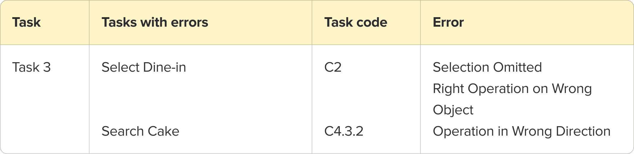
We defined a few tasks to encompass the major functions of our app. Our endpoint for these tasks was focused solely on adding and customizing items in the cart. We decided to omit the payment process and all subsequent steps and processes, as assessing them during the testing phase would be challenging. We conducted an HTA for each task, with each sub-task representing a specific action or goal within the broader task. We also conducted the SHERPA analysis to predict possible errors in the task. Then we conducted evaluation for other metrics for the same tasks. The tasks are mentioned below.
We defined a few tasks to encompass the major functions of our app. Our endpoint for these tasks was focused solely on adding and customizing items in the cart. We decided to omit the payment process and all subsequent steps and processes, as assessing them during the testing phase would be challenging. We conducted an HTA for each task, with each sub-task representing a specific action or goal within the broader task. We also conducted the SHERPA analysis to predict possible errors in the task. Then we conducted evaluation for other metrics for the same tasks. The tasks are mentioned below.
We defined a few tasks to encompass the major functions of our app. Our endpoint for these tasks was focused solely on adding and customizing items in the cart. We decided to omit the payment process and all subsequent steps and processes, as assessing them during the testing phase would be challenging. We conducted an HTA for each task, with each sub-task representing a specific action or goal within the broader task. We also conducted the SHERPA analysis to predict possible errors in the task. Then we conducted evaluation for other metrics for the same tasks. The tasks are mentioned below.
Setting Up
Setting Up
Signup and add two delivery addresses
Meluha - The Fern as home address (use search)
Wankhede Stadium as work address (use map).
Signup and add two delivery addresses
Meluha - The Fern as home address (use search)
Wankhede Stadium as work address (use map).
Signup and add two delivery addresses
Meluha - The Fern as home address (use search)
Wankhede Stadium as work address (use map).
Delivery
Delivery
Add a burger (McAloo Tikki) from the menu.
Skip the recommendations and the customization.
Add a side (Mexican Cheesy fries) from the menu.
Place order to home address.
Add a burger (McAloo Tikki) from the menu.
Skip the recommendations and the customization.
Add a side (Mexican Cheesy fries) from the menu.
Place order to home address.
Add a burger (McAloo Tikki) from the menu.
Skip the recommendations and the customization.
Add a side (Mexican Cheesy fries) from the menu.
Place order to home address.
Dine In
Dine In
Signup and add two delivery addresses
Meluha - The Fern as home address (use search)
Wankhede Stadium as work address (use map).
Signup and add two delivery addresses
Meluha - The Fern as home address (use search)
Wankhede Stadium as work address (use map).
Signup and add two delivery addresses
Meluha - The Fern as home address (use search)
Wankhede Stadium as work address (use map).
Take Away
Take Away
Select the takeaway store as R-Mall Thane.
Add a burger under 500 calories.
Customize the burger to have 1 cheese slice.
Add 1 medium fries from recommendations.
Select the takeaway store as R-Mall Thane.
Add a burger under 500 calories.
Customize the burger to have 1 cheese slice.
Add 1 medium fries from recommendations.
Select the takeaway store as R-Mall Thane.
Add a burger under 500 calories.
Customize the burger to have 1 cheese slice.
Add 1 medium fries from recommendations.
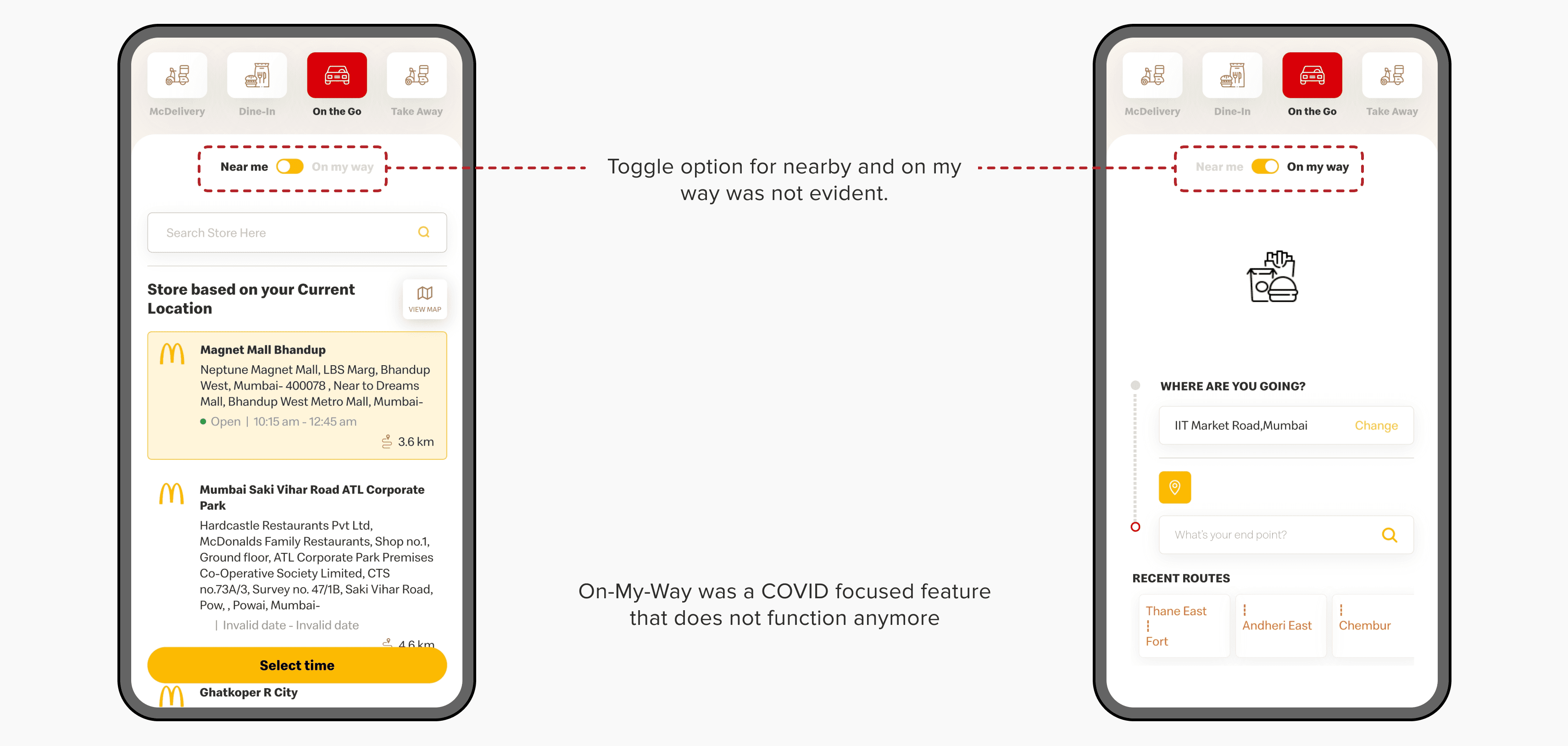
On The Go
On The Go
Select a McDonald’s store that is between 15 and 22 minutes while travelling from Thane to CSMT.
Set the arriving time 30 minutes from the current time.
Add a burger (McChicken Burger) using quick order.
Add vehicle credentials.
Signup and add two delivery addresses
Meluha - The Fern as home address (use search)
Wankhede Stadium as work address (use map).
Select a McDonald’s store that is between 15 and 22 minutes while travelling from Thane to CSMT.
Set the arriving time 30 minutes from the current time.
Add a burger (McChicken Burger) using quick order.
Add vehicle credentials.
SHERPA Predictions
SHERPA Predictions
SHERPA Predictions
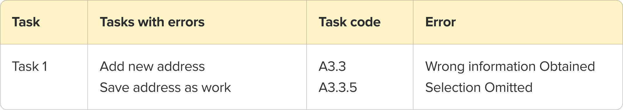
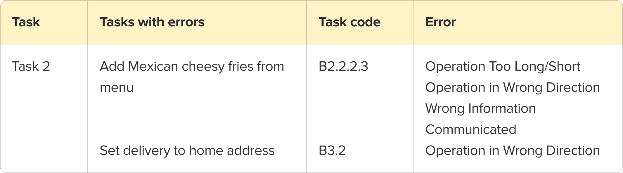


SHERPA VALIDATION
SHERPA VALIDATION
SHERPA VALIDATION
After defining tasks, we conducted usability tests. During the usability tests we observed the users and noted down any of the errors from the SHERPA analysis method and did a frequency mapping of the same. The results from SHERPA validation are shown below.
After defining tasks, we conducted usability tests. During the usability tests we observed the users and noted down any of the errors from the SHERPA analysis method and did a frequency mapping of the same. The results from SHERPA validation are shown below.
After defining tasks, we conducted usability tests. During the usability tests we observed the users and noted down any of the errors from the SHERPA analysis method and did a frequency mapping of the same. The results from SHERPA validation are shown below.
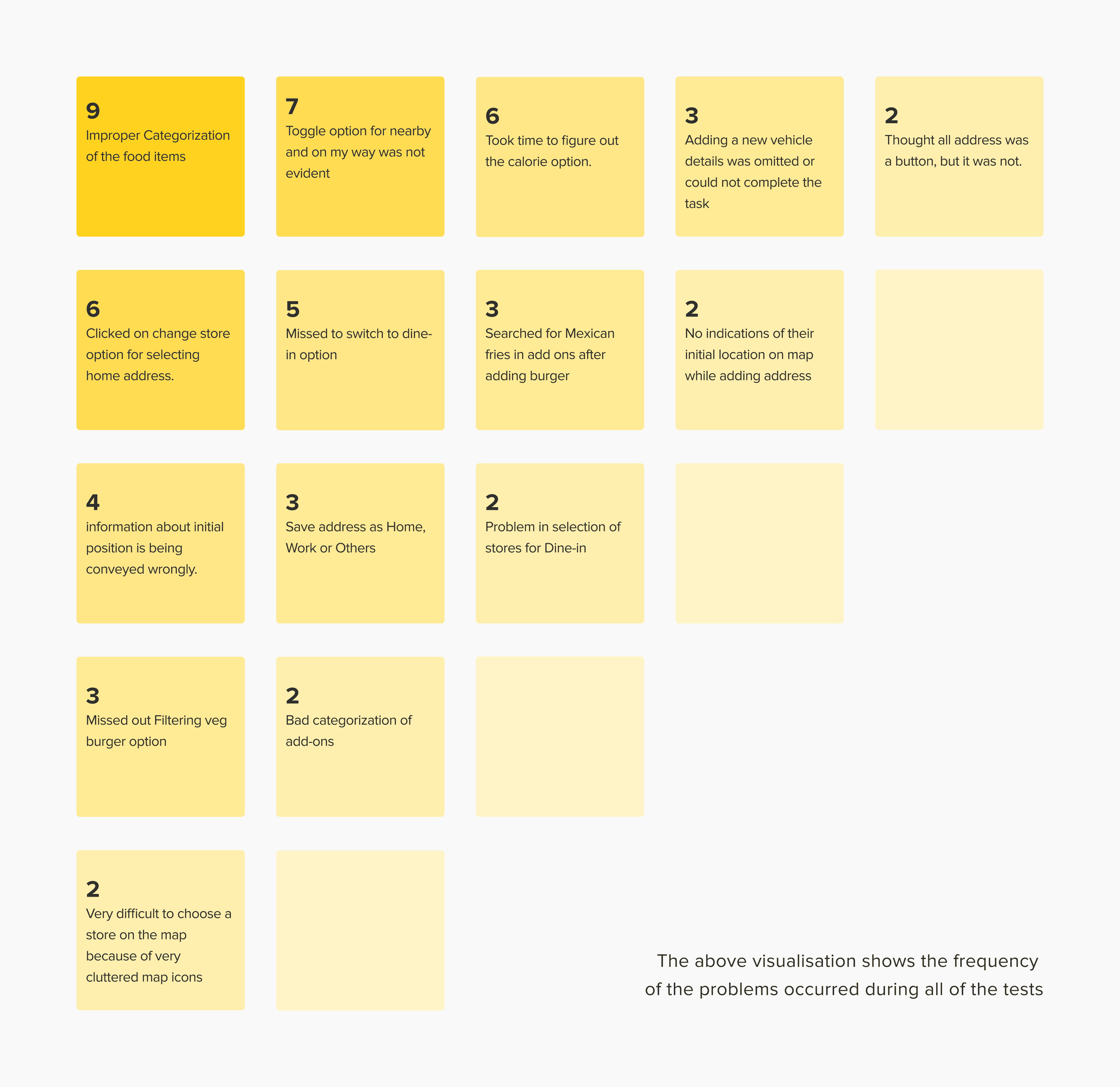
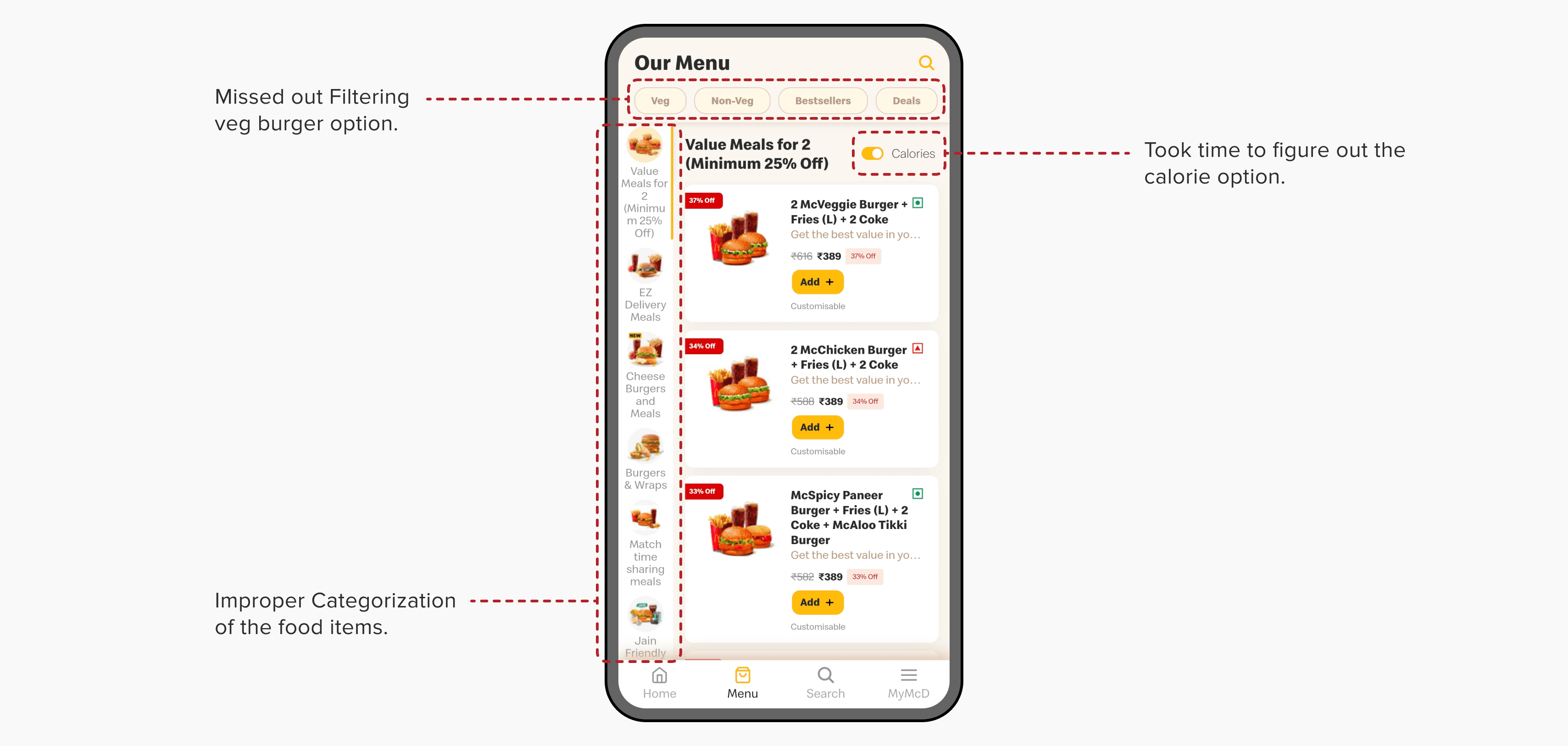
From this we understood that the major problem in the application was around categorisation of items and inconsistent interface.
From this we understood that the major problem in the application was around categorisation of items and inconsistent interface.
From this we understood that the major problem in the application was around categorisation of items and inconsistent interface.
HEURISTIC EVALUATION
HEURISTIC EVALUATION
HEURISTIC EVALUATION
We then conducted a heuristic evaluation based on Jakob Nielsen's heuristics. We took reference of Xerox 13 checklist, answered the questions and gained insights about the major problems in the system.
We then conducted a heuristic evaluation based on Jakob Nielsen's heuristics. We took reference of Xerox 13 checklist, answered the questions and gained insights about the major problems in the system.
We then conducted a heuristic evaluation based on Jakob Nielsen's heuristics. We took reference of Xerox 13 checklist, answered the questions and gained insights about the major problems in the system.
Visibility of System Status
Visibility of System Status
Visibility of System Status
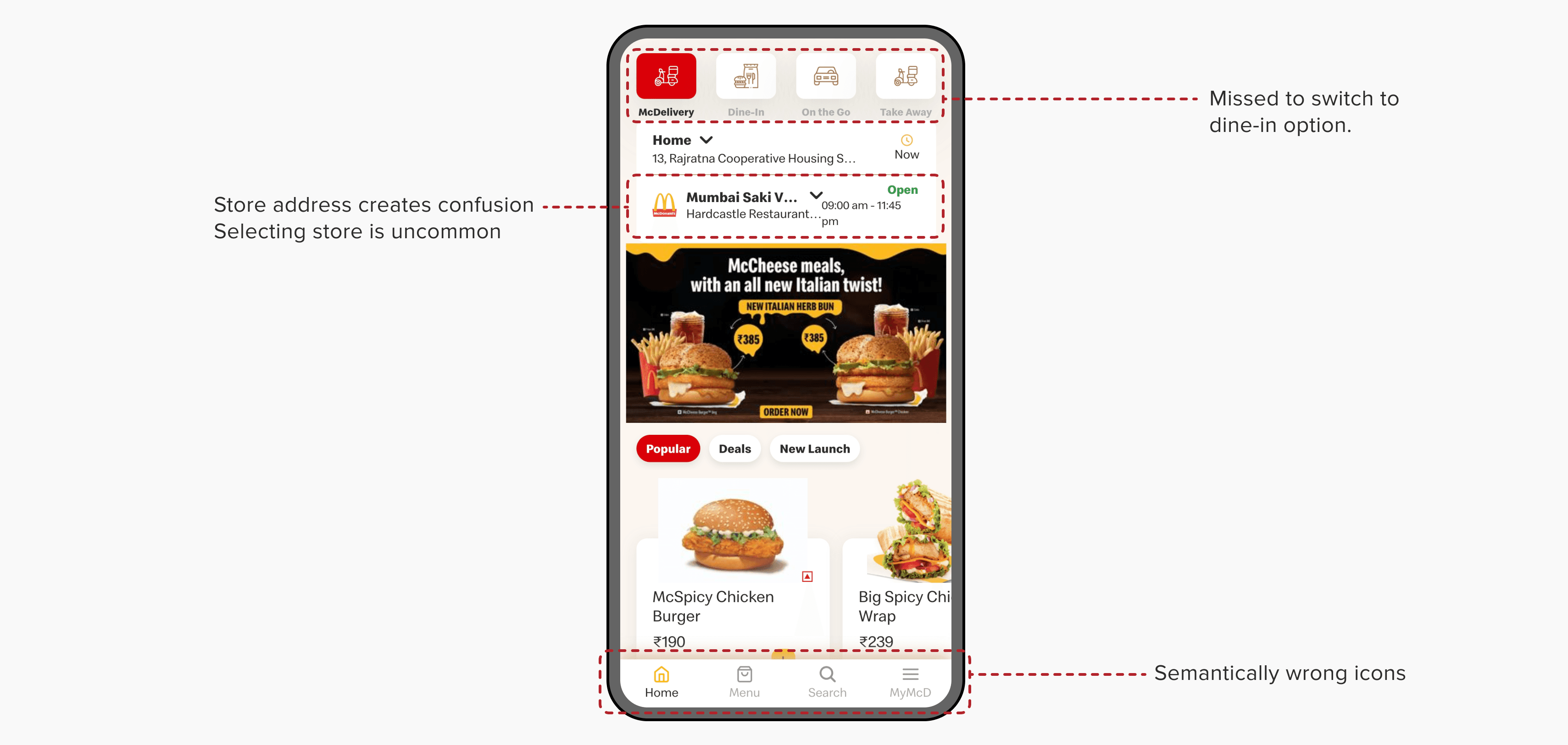
The system provides estimated time and current order status in text rather and a progress bar. The progress bar has inconsistent text field indicators
The titles usually are included in scroll, which is good for some screens but when users are in the menu they need an indication of what the order type and location is
Some displays do not have titles like the MyMcd page, home page, the address has bad heirarchy
Payment page does not have the order summary which is good to have
Consistency and Standards
Consistency and Standards
Consistency and Standards
There is no arrow or scroll bar to visit desired sections of the list. The side bar responds very slowly and there are no section breaks in the vertical lists
The menus and forms have many buttons which are and look like clickable, however there are many option that come with an icon or are in the colour of links that seem clickable but are not
There are issues with padding and typography with the sidebar in the menu, also many issues of proximity on the home screen
Users could interact with the elements however they were inconsistent
There are some fields and texts that are in the same colour as the primary, secondary or tertiary buttons that cannot be interacted with but seem like we can
There are no accordions used in the categorisation of the menu, but it is desired that users are made to scroll through the menu to see the variety of items
All fields have same heirarchy and no marks are shown on required fields
Some buttons/links/fields are inconsistent
Flexibility and Efficiency of Use
Flexibility and Efficiency of Use
Flexibility and Efficiency of Use
Although they have used the same icon for two completely different features. Some icons have issues in recall
No the system does not take any input from background actions even after taking permissions, which it should do
The system should auto detect the location while the splash sctreen appears but does not do anything
Some already asked fields are not autofilled in the menu
The system is very slow to respond. It feels like even a good device is lagging.
The system is very slow to respond. It feels like even a good device is lagging
HTA (Hierarchical Task Analysis)
SYSTEM USABILITY SCALE
SYSTEM USABILITY SCALE
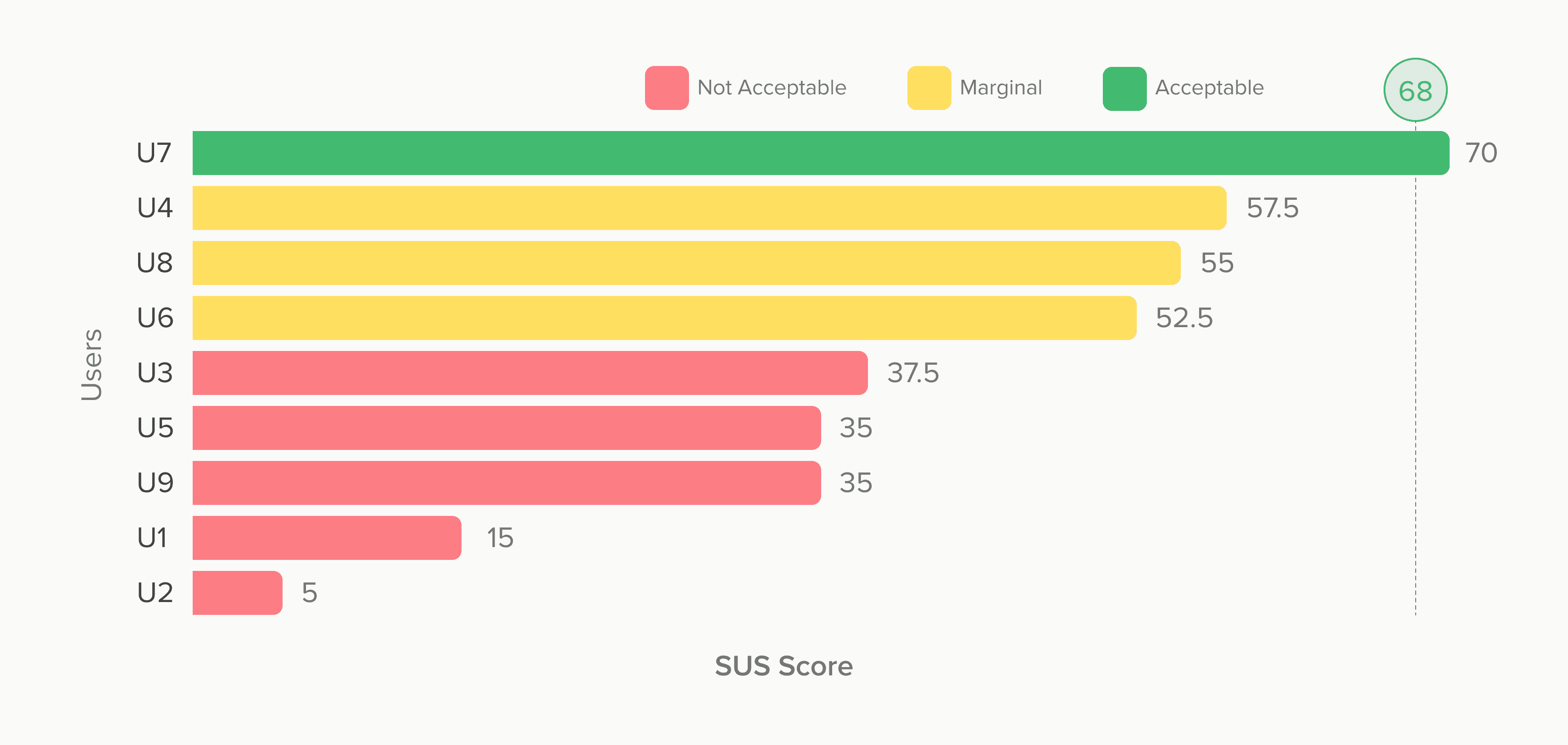
SYSTEM USABILITY SCALE
After the usability tests were done, we asked all the users to fill out the SUS questionnaire to get a sense of user satisfaction while using the app. The results of the SUS are given below. From the SUS scores we can clearly see that most of the users are unsatisfied with the overall experience of the app.
After the usability tests were done, we asked all the users to fill out the SUS questionnaire to get a sense of user satisfaction while using the app. The results of the SUS are given below. From the SUS scores we can clearly see that most of the users are unsatisfied with the overall experience of the app.
After the usability tests were done, we asked all the users to fill out the SUS questionnaire to get a sense of user satisfaction while using the app. The results of the SUS are given below. From the SUS scores we can clearly see that most of the users are unsatisfied with the overall experience of the app.
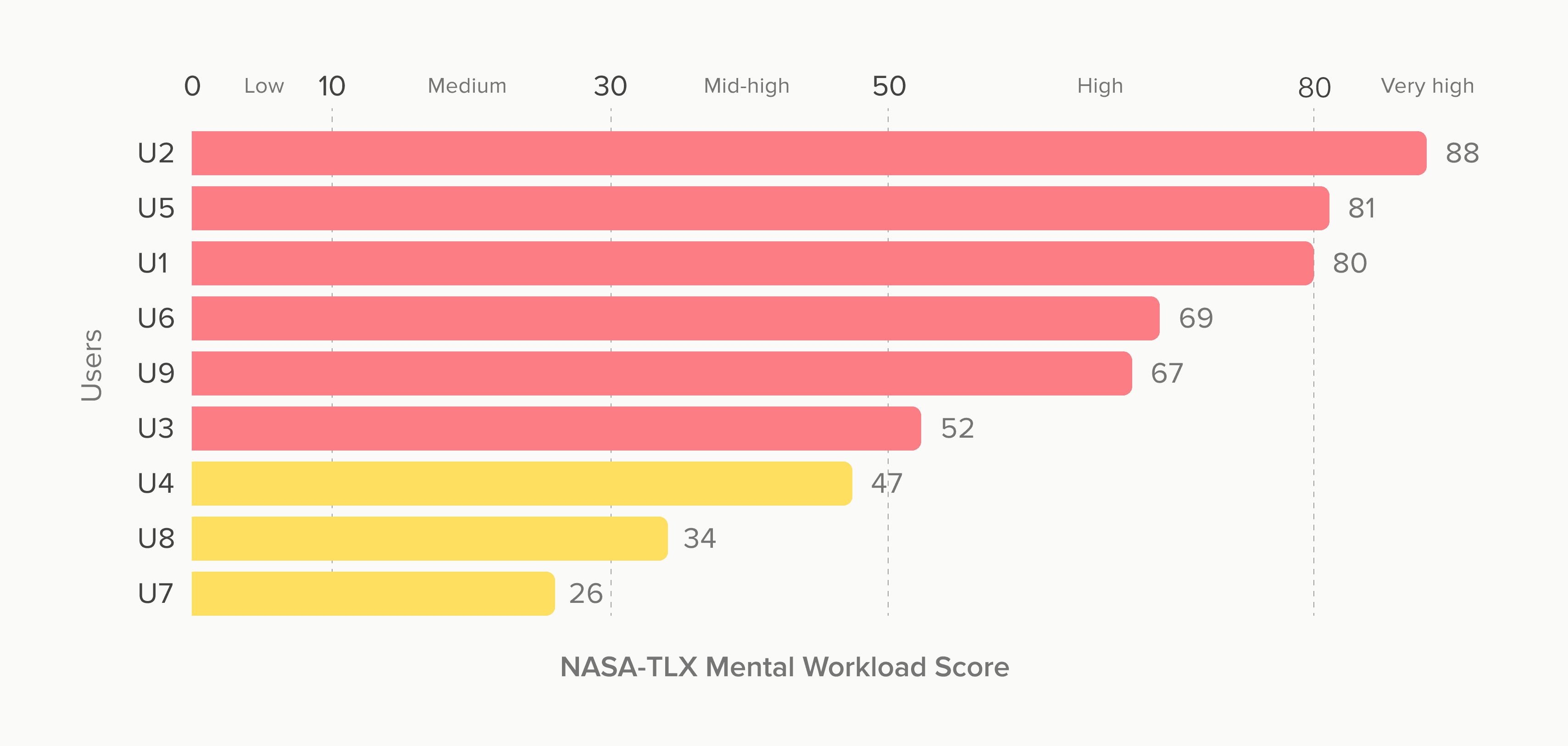
NASA-TLX
NASA-TLX
NASA-TLX
With SUS we also asked the users to fill out the NASA-TLX questionnaire to understand how much mental workload did the users feel while using the app. From the scores we can see that most of the people had a high mental workload while using the app.
With SUS we also asked the users to fill out the NASA-TLX questionnaire to understand how much mental workload did the users feel while using the app. From the scores we can see that most of the people had a high mental workload while using the app.
With SUS we also asked the users to fill out the NASA-TLX questionnaire to understand how much mental workload did the users feel while using the app. From the scores we can see that most of the people had a high mental workload while using the app.
EFFECTIVENESS & EFFICIENCY
EFFECTIVENESS & EFFICIENCY
EFFECTIVENESS & EFFICIENCY
While conducting the tests, we also noted down the success of the tasks and time taken to complete the task. From this we calculated the effectiveness and efficiency of the app. This metric can be used in pre and post redesign scenario to compare them.
While conducting the tests, we also noted down the success of the tasks and time taken to complete the task. From this we calculated the effectiveness and efficiency of the app. This metric can be used in pre and post redesign scenario to compare them.
While conducting the tests, we also noted down the success of the tasks and time taken to complete the task. From this we calculated the effectiveness and efficiency of the app. This metric can be used in pre and post redesign scenario to compare them.
Effectiveness
97.78 %
Efficiency
Effectiveness
0.006
97.78 %
goal/sec
Efficiency
0.006
goal/sec
COMPETITOR ANALYSIS
COMPETITOR ANALYSIS
COMPETITOR ANALYSIS
We analysed the apps of McDonald's competitors to understand how they were tackling the issues that we faced. The limitation of competitor analysis is that we could not conduct test on the competitor apps and so we cannot objectively say that they are better. We included apps of individual fast food chains, that deal with at least delivery and dine-in ordering systems. The competitors were Burger King, KFC, Dominos and Burger King. The main insights that we gained from the competitor analysis are mentioned below.
We analysed the apps of McDonald's competitors to understand how they were tackling the issues that we faced. The limitation of competitor analysis is that we could not conduct test on the competitor apps and so we cannot objectively say that they are better. We included apps of individual fast food chains, that deal with at least delivery and dine-in ordering systems. The competitors were Burger King, KFC, Dominos and Burger King. The main insights that we gained from the competitor analysis are mentioned below.
We analysed the apps of McDonald's competitors to understand how they were tackling the issues that we faced. The limitation of competitor analysis is that we could not conduct test on the competitor apps and so we cannot objectively say that they are better. We included apps of individual fast food chains, that deal with at least delivery and dine-in ordering systems. The competitors were Burger King, KFC, Dominos and Burger King. The main insights that we gained from the competitor analysis are mentioned below.

Set Up
The competitors give an option of skipping onboarding at start as opposed to McDelivery. Also they automatically detect location while launching and detect OTP during onboarding.
The competitors give an option of skipping onboarding at start as opposed to McDelivery. Also they automatically detect location while launching and detect OTP during onboarding.
Categorisation
Set Up
The competitors give limited but easy to comprehend categorisation of items without overwhelming the users, as opposed to McDelivery which has a long list of confusing categories.
The competitors give an option of skipping onboarding at start as opposed to McDelivery. Also they automatically detect location while launching and detect OTP during onboarding.
The competitors give limited but easy to comprehend categorisation of items without overwhelming the users, as opposed to McDelivery which has a long list of confusing categories.
Categorisation
The competitors give limited but easy to comprehend categorisation of items without overwhelming the users, as opposed to McDelivery which has a long list of confusing categories.
Navigation
The competitors give an option using a top bar to traverse through the menu instead of a difficult to use sidebar that McDelivery uses.
The competitors give an option using a top bar to traverse through the menu instead of a difficult to use sidebar that McDelivery uses.
Check Out
Navigation
The competitors give a quick summary of the order details like items, order type and payment amount before checking out. Also logging in is not needed for ordering.
The competitors give an option using a top bar to traverse through the menu instead of a difficult to use sidebar that McDelivery uses.
The competitors give a quick summary of the order details like items, order type and payment amount before checking out. Also logging in is not needed for ordering.
Check Out
The competitors give a quick summary of the order details like items, order type and payment amount before checking out. Also logging in is not needed for ordering.
KEY FINDINGS
KEY FINDINGS
KEY FINDINGS
These were the main insights that we gained from all the analysis that we did.
These were the main insights that we gained from all the analysis that we did.
These were the main insights that we gained from all the analysis that we did.
REDESIGNED INTERFACE
REDESIGNED INTERFACE
REDESIGNED INTERFACE
Based on the key insights mentioned above, we ideated an interface which could be better than the current one.
Based on the key insights mentioned above, we ideated an interface which could be better than the current one.
Based on the key insights mentioned above, we ideated an interface which could be better than the current one.
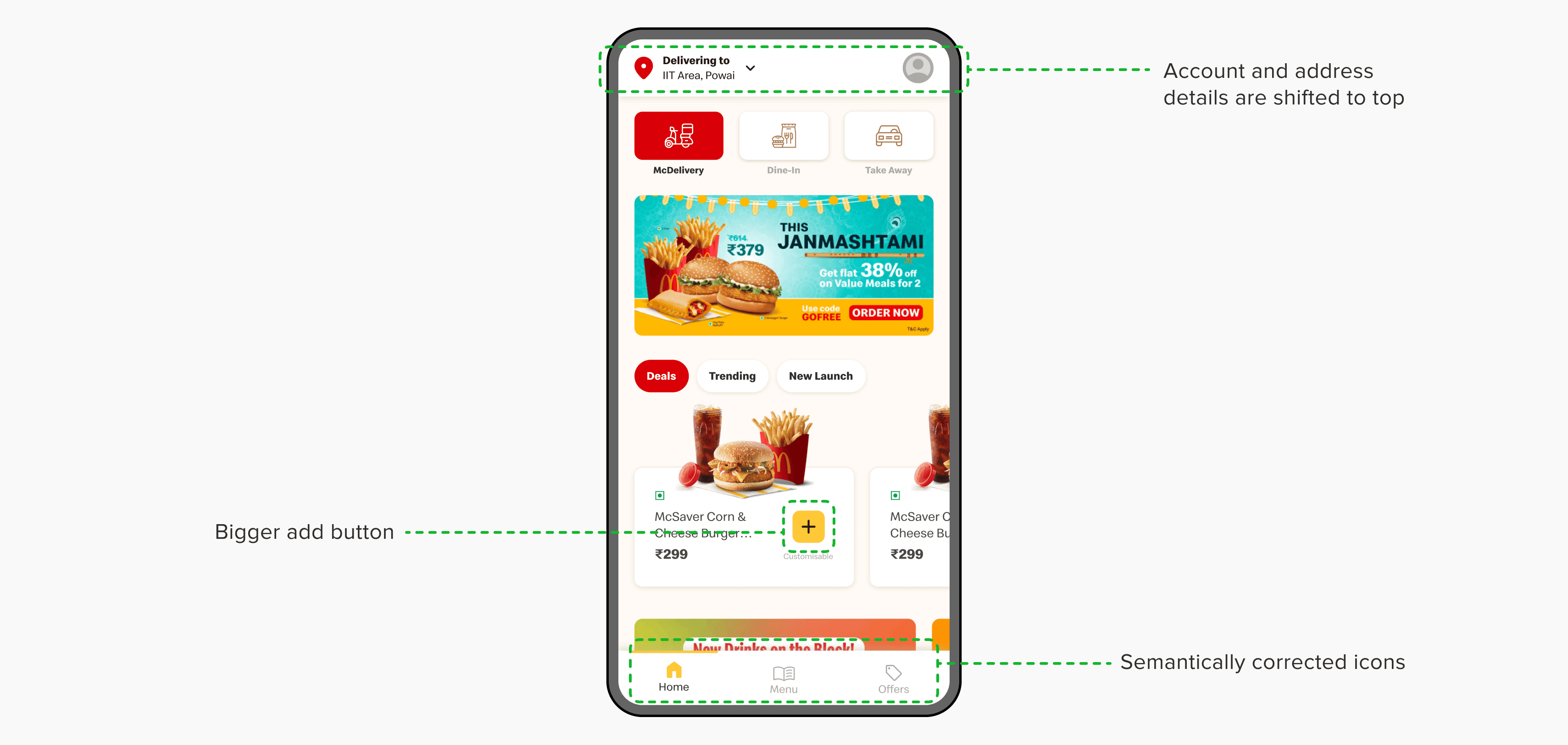
The store address is removed as it created confusion and it is not common for food services to provide the choice of store. The consumer is less concerned about which branch the food comes from. The user profile and address are moved to the top of the screen due to familiarity of the users.
The store address is removed as it created confusion and it is not common for food services to provide the choice of store. The consumer is less concerned about which branch the food comes from. The user profile and address are moved to the top of the screen due to familiarity of the users.
The store address is removed as it created confusion and it is not common for food services to provide the choice of store. The consumer is less concerned about which branch the food comes from. The user profile and address are moved to the top of the screen due to familiarity of the users.
We created a dedicated page with offers to attract more consumers to the application as well as make it easy to discover ongoing offers which currently did not have a dedicated space.
We created a dedicated page with offers to attract more consumers to the application as well as make it easy to discover ongoing offers which currently did not have a dedicated space.
We created a dedicated page with offers to attract more consumers to the application as well as make it easy to discover ongoing offers which currently did not have a dedicated space.
Colophon
Colophon
Colophon
The font used in this project is Speedee. The icons used are from Material Symbols and the images used are from McDelivery app itself.
The font used in this project is Speedee. The icons used are from Material Symbols and the images used are from McDelivery app itself.
The font used in this project is Speedee. The icons used are from Material Symbols and the images used are from McDelivery app itself.
Project Guide
Project Guide
Project Guide
Prof. Wricha Mishra
Prof. Wricha Mishra
Prof. Wricha Mishra
Course
Course
Course
DE315 | Applied Ergonomics
DE315 | Applied Ergonomics
DE315 | Applied Ergonomics